
Color and Surface Treatment Reviews
A side table can appear greener, glossier, or more substantial because the room, camera, or highlights changed. Before reviewing product color rendering, identify the intended difference and the conditions that should remain fixed.
The image can support a decision about visible color and surface direction. It cannot confirm physical color, coating performance, manufacturability, safety, compliance, or market response. Those questions require samples, technical records, or qualified production input.
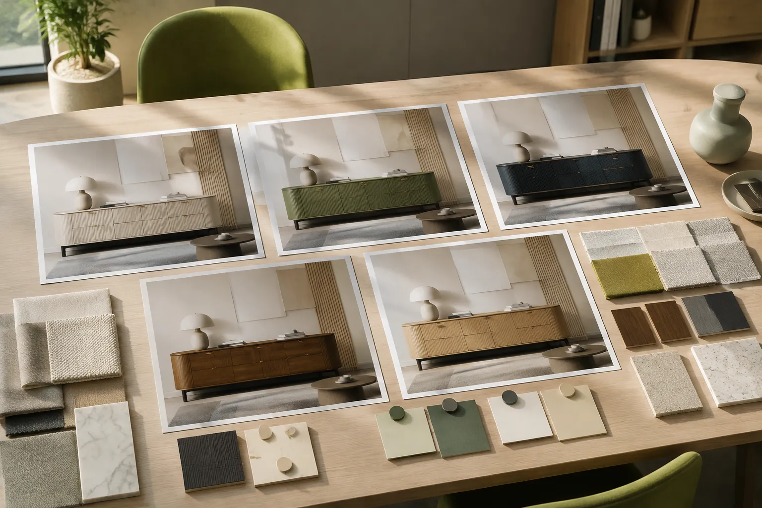
More specific pages
These pages continue the topic in smaller, more specific directions.
What the Review Can Decide
A controlled comparison can show relative hue, contrast, sheen cues, roughness cues, edge response, and the relationship between a treatment and the product form. It may also reveal whether joints, component boundaries, or contact points remain legible.
These are visual findings within the depicted conditions. They do not establish paint formulation, coating thickness, material composition, durability, or an exact physical match.
A review should end with one of three outcomes:
- Direction selected: one variant better supports the named visual criteria.
- Revision required: the difference is unclear or the comparison conditions are inconsistent.
- Decision deferred: the question depends on a sample, source record, specification, or specialist.
A polished image can support a bounded color decision. It does not turn that decision into production approval.
Start With the Intended Difference
“Show several green versions” leaves too many decisions open. It does not say whether the team is comparing hue, value, saturation, sheen, opacity, or a complete surface treatment.
A stronger product color rendering brief describes the difference in terms reviewers can see:
- Compare a muted green direction with a more saturated direction.
- Compare one dark blue color with lower-sheen and higher-sheen cues.
- Test whether a warm neutral treatment preserves visible grain direction.
- Compare an opaque painted surface with one that retains more substrate character.
- Assess matching and contrasting finishes across a fixture body, canopy, and cable.
The brief must also identify fixed conditions. Geometry, component placement, camera position, framing, lighting, and room context may need to remain unchanged.
The criterion comes first. The rendering setup follows.
Record the Inputs Before Commissioning
Product Form and Component Boundaries
Identify the product version and its relevant components. For furniture, that may include panels, joints, bases, hardware, upholstery, and contact points. For lighting, it may include the fixture body, shade, diffuser, canopy, cable, and mounting parts.
Color placement depends on these boundaries. If the model changes between variants, reviewers cannot attribute every visible difference to the finish.
Color Direction
Color names such as charcoal, sage, ivory, or bronze can describe visibly different directions. Record relative qualities instead: warmer or cooler, lighter or darker, muted or saturated, opaque or substrate-revealing.
A reference image can narrow the direction, but its role needs a label. State whether it supports color, surface response, room context, composition, or another limited feature.
Surface Treatment
Color and finish are related but not interchangeable. One nominal color can appear different when sheen, roughness, grain, weave, translucency, or edge response changes.
If color is the only variable, do not introduce a different texture treatment into one option. If both color and finish are changing, make that combination explicit in the variant label.
Reference Status
Record each reference's purpose, source, and usage status. Visual relevance does not establish permission to reuse an image or reproduce a design feature.
Separate material inspiration from content intended to appear in a deliverable. Ownership and permitted-use questions belong with the relevant rights holder or qualified reviewer.
Keep Comparison Views Consistent
Consistent views keep the proposed color or treatment as the main variable. This is a practical review convention, not a universal production standard.
Match Camera and Framing
Angle and image scale change which surfaces dominate. A tighter crop may make texture more prominent, while a higher camera can expose a tabletop color that was barely visible before.
Match camera position, viewing angle, product scale, crop, orientation, background placement, and image dimensions where practical. If another angle is necessary, provide it for every variant.
Keep Geometry Matched
A colorway comparison should not quietly include a changed handle, shade profile, joint, or base. Those changes create additional reasons to prefer one image.
When geometry must change, identify it in both the variant label and the approval record. The comparison is then a combined design review rather than an isolated finish assessment.
Control Lighting and Context
Object appearance and subjective color judgments can vary with illumination, observation conditions, and comparison protocol. Research supports that limited caution, but it does not validate a particular furniture or lighting render setup.
For an isolated colorway review, preserve the lighting, background, and room elements. To assess several depicted contexts, change one context at a time and retain a neutral baseline.
Preserve Output Treatment
Exposure, contrast, white balance, and post-processing changes can resemble a change in product color. Record the output treatment and avoid option-specific adjustments unless image treatment is itself under review.
Ask one diagnostic question: did the product direction change, or did the image treatment change? Uncertainty here requires a revised comparison.
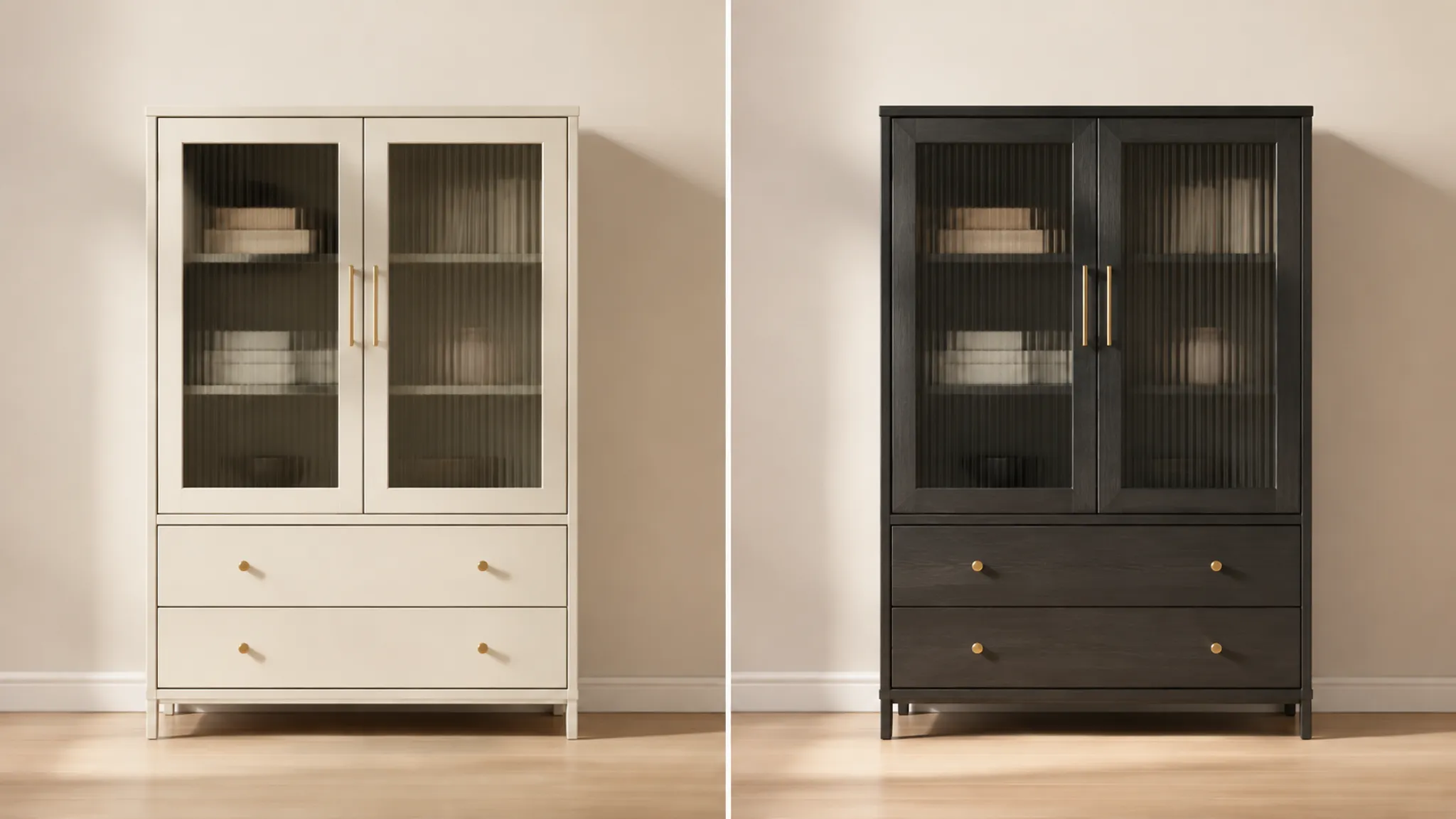
Review Observable Surface Cues
Hue and Value Relationships
Compare the product with adjacent components and the background. Check whether a dark frame remains legible against a wall, or whether a pale shade loses its boundary in the scene.
The render shows those relationships in one depicted setting. Physical color under other conditions remains unresolved.
Sheen and Edge Response
Inspect highlight size, intensity, and placement. Tighter highlights may suggest higher sheen, while broader responses may suggest a lower-sheen direction.
Then check chamfers, curved edges, seams, perforations, and contact points. If a treatment hides an important boundary, name the affected edge and determine whether the revision concerns lighting, finish direction, or both.
Roughness and Texture Scale
Grain, weave, stippling, or brushed marks that appear too large can distort perceived product scale. Repeated texture patterns may also become conspicuous across tabletops, cabinet fronts, or shades.
Directional surfaces need component-level instructions. A tabletop, leg, drawer front, upholstered panel, and lamp shade may require different grain or weave orientations.
Translucency and Layering
For glass, textile, polymer, or thin ceramic concepts, an image may suggest translucency and overlapping color. It cannot establish transmission properties or fabrication behavior.
Use the comparison to choose a visual direction, then move physical behavior to sample and production review.
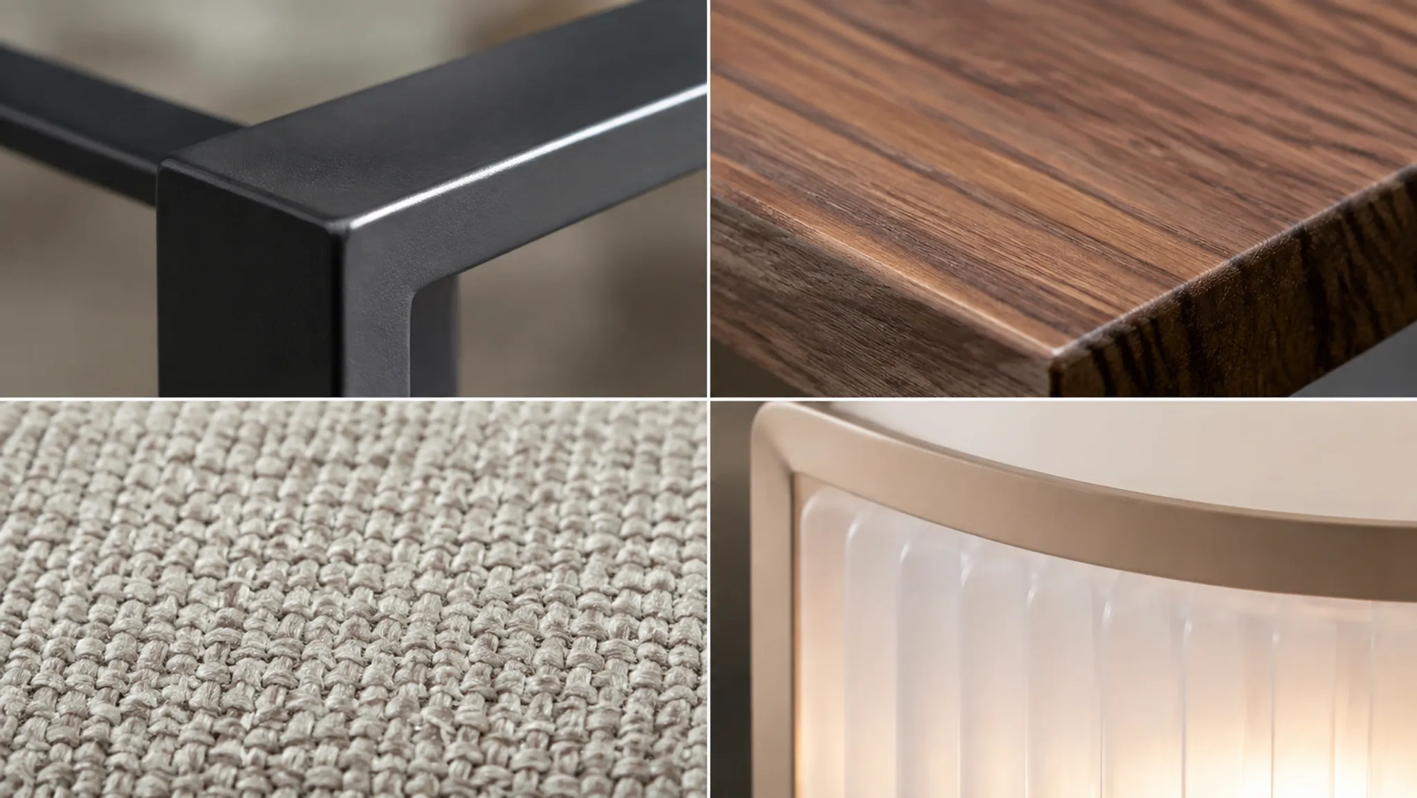
Use Side-by-Side Comparison Without Collapsing the Decision
State the review criterion before comments begin. Neutral identifiers such as “Option A” and “Option B” avoid placing a preference inside the label; short factual descriptors can identify the intended change.
| Review field | What to record |
|---|---|
| Variant | Neutral identifier and short direction |
| Intended change | Color, sheen, texture, translucency, or combined treatment |
| Fixed conditions | View, geometry, lighting, context, and output treatment |
| Visible finding | What the image makes visible |
| Decision criterion | Why the finding matters to the brief |
| Status | Select, revise, compare again, or defer |
| Unresolved issue | Missing reference, sample, record, or specialist input |
| Handoff | Participant responsible for the next decision |
Avoid reducing every response to “looks better.” Preference, vividness, naturalness, and acceptability describe different reactions and do not predict commercial performance.
Comments such as “less saturated,” “keeps the edge visible,” or “conflicts less with the collection palette” give the next participant an actionable request.
Setting Up a Rendered Colorway Comparison for a Painted Side Table
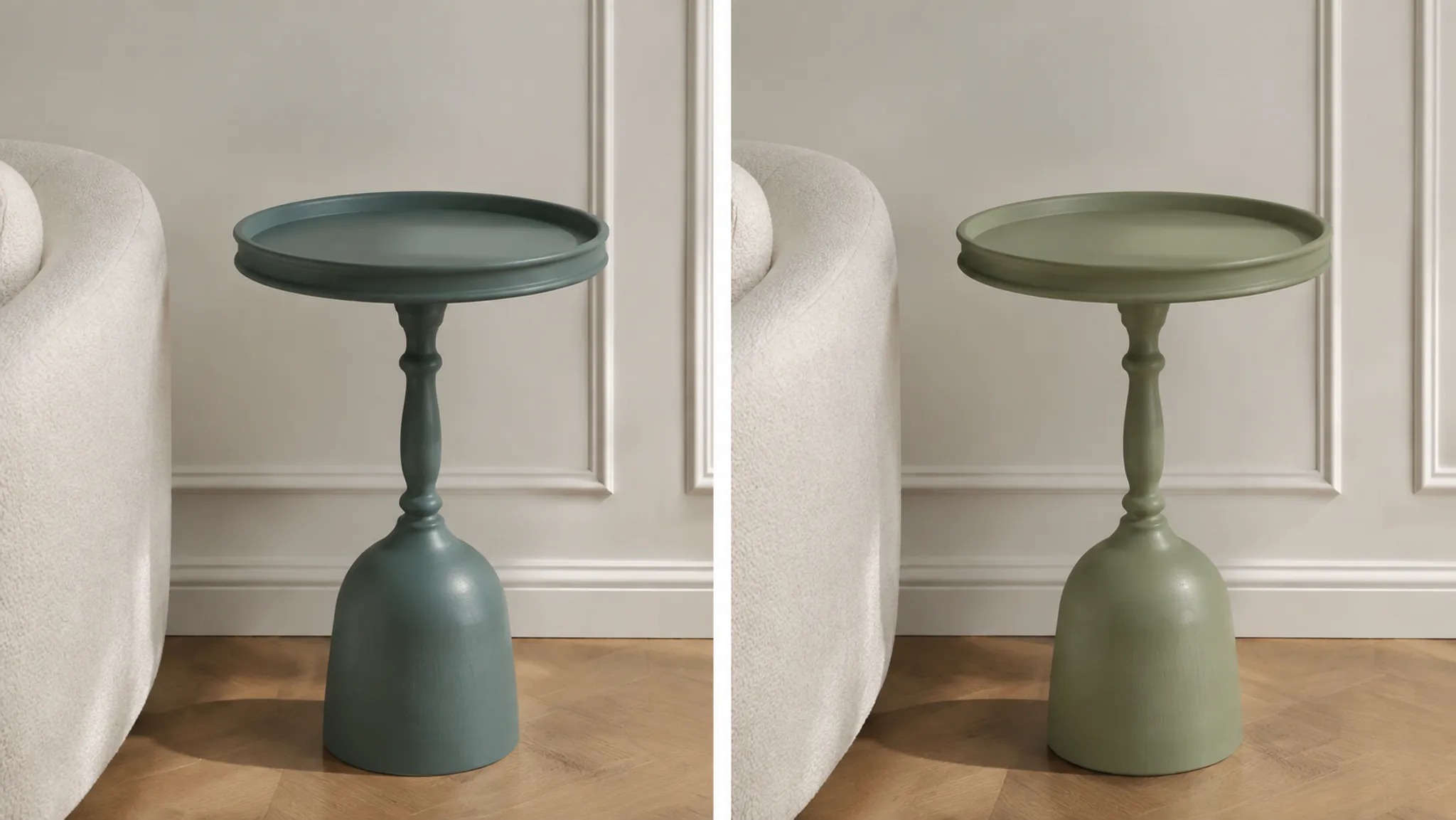
Consider an illustrative comparison between a muted blue-green side table and a warmer, slightly lighter direction. The table model, camera, crop, background, lighting, and room context remain matched.
If sheen is also under review, each color receives the same two labeled sheen treatments. Otherwise, the team could mistake a highlight difference for a color preference.
The neutral view asks which direction keeps the silhouette and tabletop edge legible. A matched room-context view then checks the relationship with the floor, wall, and nearby upholstery.
Select variant B as the visual color direction. It keeps the tabletop edge distinct from the wall and supports the warmer collection palette in the depicted context. Physical color and coating response remain unresolved; request a material sample and production input.
This is a worked editorial example, not a case study or evidence of render-to-production accuracy. Its purpose is to show how an observation becomes a bounded decision.
Adjust the Emphasis for Furniture and Lighting
Furniture reviews often emphasize broad surfaces, textile scale, grain direction, seams, hardware relationships, and contact points. Large uninterrupted faces can expose texture repetition or uneven visual treatment.
Lighting reviews may place more emphasis on the body, shade, diffuser, canopy, cable, and reflected or emitted light depicted in the concept. Illuminated and unlit views answer different visual questions.
Light-source metrics are not approval scores for furniture or fixture colorway renders. Questions involving emitted light, electrical performance, installation, or compliance require the appropriate technical handoff.
Check the Direction Across a Collection
A selected treatment should be compared with related products. Collection consistency does not always mean identical finishes, but the intended relationship needs to be visible and recorded.
- Compare relative warmth, coolness, and light-to-dark hierarchy.
- Check repeated body, accent, and hardware colors.
- Inspect grain, weave, brushed direction, and sheen relationships.
- Use the same depicted context when subtle differences matter.
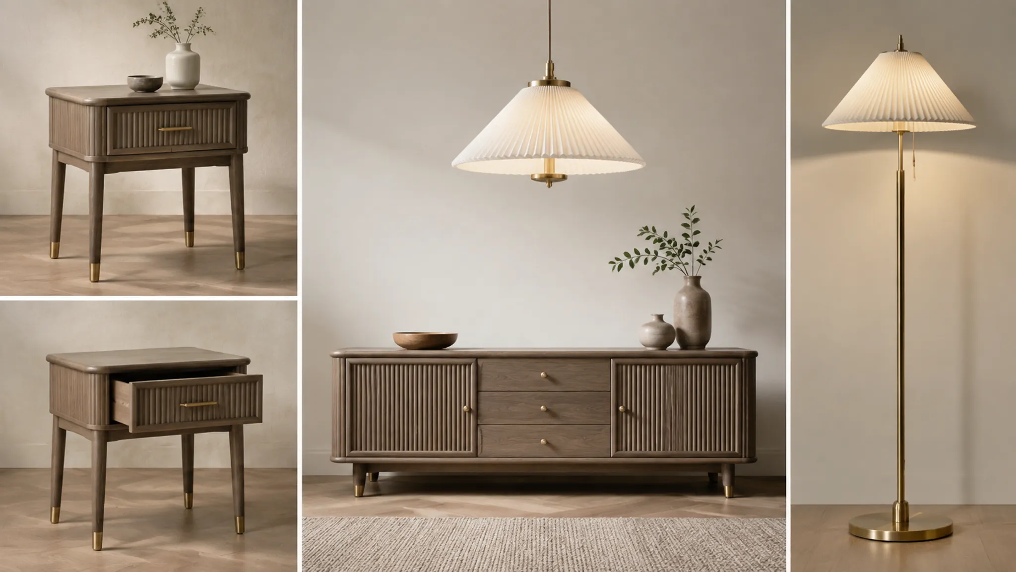
A table and cabinet may share a body color while using different hardware. A pendant and floor lamp may use related metal directions while retaining different diffuser treatments.
If a collection board mixes angles, backgrounds, or lighting conditions, treat it as a broad coordination view. Return to matched images before deciding a subtle color or finish difference.
Translate Visual Symptoms Into Brief Revisions
| Visual symptom | Brief revision |
|---|---|
| Variants appear almost identical | Define or increase the intended color or surface difference |
| One option appears more vivid in a brighter scene | Match lighting and output treatment before comparing |
| Texture dominates the product form | Reduce visible texture scale or contrast |
| Curved edges disappear in a dark variant | Reassess edge response under the same lighting |
| Grain direction changes between components | Specify orientation by component and prepare matched views |
| Room colors overwhelm the difference | Add a neutral baseline comparison |
| Reviewers disagree about “quality” | Replace the broad label with observable criteria |
| A finish appears convincing but lacks a record | Keep the direction provisional and request the missing sample or specification |
Do not ask an image maker to resolve an undefined production question visually. Name coating behavior, fabrication, installation, or physical color as a separate dependency.
Write Approval Notes With Defined Limits
“Approved” can travel farther than intended. A useful note identifies the selected variant, image version, comparison conditions, criterion, accepted visible qualities, and unresolved questions.
“Selected as the color direction shown in comparison view 03” is more precise than unrestricted approval. If the finish remains provisional, state that beside the decision rather than in a distant general note.
Version changes also matter. When later imagery changes geometry, lighting, context, or output treatment, record whether the earlier color decision still applies.
When a Sample or Specialist Is Still Needed
Request a material sample or separate technical assessment when the decision depends on physical color, actual texture, coating and substrate interaction, gloss, tactile qualities, translucency, durability, fabrication, assembly, safety, installation, or regulatory requirements.
The sample and render serve different purposes. The image organizes visual direction and room context; the sample or technical record addresses physical and production variables.
Available research supports caution about viewing conditions, but it does not provide a furniture-specific sampling procedure. Relevant conditions and tolerances should be set through the appropriate color-management, supplier, production, or technical workflow.
Evidence Limits and the Final Review Sequence
Peer-reviewed research supports limited statements about viewing-condition sensitivity, object-color variability, and comparison protocol. It does not establish a standard furniture or lighting product-render workflow.
The current sources also leave software behavior, display color management, coating properties, production tolerances, physical finish evaluation, and reference rights outside the evidence available for this page. Treat precise questions in those areas as documented handoffs.
- Define the difference. Name the color direction or visible surface cue under review.
- Record fixed conditions. Identify the geometry, view, lighting, context, and output treatment.
- Prepare matched comparisons. Include a neutral baseline and only the contextual views needed.
- Assess observable cues. Compare hue, sheen, roughness, directionality, translucency, and edge response where relevant.
- Separate criteria. Do not collapse color preference, form legibility, collection fit, and surface character into one verdict.
- Document the decision. Record the selected version, conditions, criterion, and visible finding.
- Name what remains unresolved. Identify the missing sample, source record, specification, or specialist.
- Assign the handoff. State who owns the next physical, technical, production, or rights decision.
The useful output is a traceable visual decision, not merely a preferred image. Record the selected direction, then request the sample or specialist input needed to resolve the remaining assumption.