
Setting Up a Rendered Colorway Comparison for a Painted Side Table
A reviewable product colorway comparison uses two painted side-table renders built from the same model, camera, lighting, scale cue, and room context. Change the colorway direction, then compare the images against named visual criteria rather than general preference.
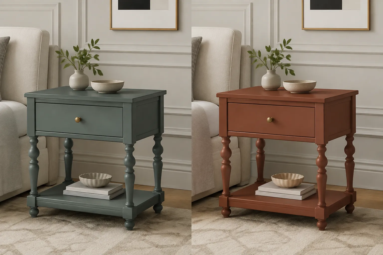
The render can show whether one direction reads warmer, darker, quieter, brighter, or more distinctive in the selected scene. It cannot establish the physical finish, coating behavior, manufacturability, structural performance, safety, compliance, or commercial response.
Begin by locking the comparison conditions. Record the model version, camera view, crop, light direction, room setting, floor material, background, and finish assumptions before judging either option.
Hold the Comparison Conditions Constant
The two images need to isolate the intended change. Keep these elements consistent:
- Side-table geometry and proportions
- Camera height, focal length, viewing angle, and crop
- Object scale within the frame
- Light direction, intensity, softness, and color assumption
- Shadow placement and contact points
- Room context, floor, wall, and nearby objects
- Image exposure and display treatment
- Surface roughness and sheen assumptions, unless finish is part of the comparison
- Component placement, including shelves, legs, handles, caps, and hardware
A camera shift makes silhouette readability harder to compare. A changed room can make one colorway appear stronger because of its surroundings rather than its own direction.
Use one primary comparison view. Add a second view only when it resolves a meaningful uncertainty, such as a side plane, lower shelf, rear edge, or contact point.
Define the Two Painted Side-Table Colorways
Name each direction before rendering. The names should describe the intended visual difference without implying a production result.
- Colorway A: muted blue-green with a lower-value appearance
- Colorway B: warmer red-brown with higher apparent saturation
These labels establish a review direction. They do not replace a paint code, measured color reference, or finish specification.
The brief should identify the relative hue direction, relative value, relative saturation or chroma, sheen assumption, painted components, unchanged hardware, room context, and physical reference required after the image review.
Use relative language when the reference record does not provide measured values. “Warmer than Colorway A” describes the comparison more responsibly than an unsupported statement about a particular hue.
Compare Named Visual Criteria
Review both directions under the same image conditions and write one observation for each criterion. The purpose is to record what changes the decision.
Relative Hue Direction
Ask whether one colorway reads warmer, cooler, greener, bluer, redder, or more neutral in the stated scene.
The render shows a relative direction within that setup. It does not confirm how the paint will appear under other light sources or on a physical coated surface.
Colorway B reads warmer than Colorway A in the locked room view; physical hue confirmation remains open.
Value and Saturation
Value concerns the apparent lightness or darkness of the painted form. Saturation concerns how muted or vivid the color appears.
Review the broad painted areas first, then inspect whether highlights, shadows, and edge reflections alter the impression. A darker value may make the table feel visually heavier, while higher saturation may draw more attention to its footprint.
Do not treat the displayed image as a measured color record. Request a physical paint chip or finish sample when a small distinction affects approval.
Silhouette Readability
Check whether the table remains legible against the wall, floor, and surrounding objects. Inspect the outer contour, leg spacing, top thickness, shelf opening, and lower contact points.
A colorway that blends into the room may reduce silhouette visibility. A more contrasting direction may clarify the form while attracting more visual attention. This is a room-context observation, not evidence that the object will look the same in every installation.
Component Placement
Color can change how separate parts are read. Compare the tabletop, legs, shelf, drawer, trim, and hardware as grouped components.
- Does the top remain distinct from the base?
- Does the lower shelf recede or compete with the top?
- Are small components still visible at the chosen scale?
- Does one direction make a component appear misplaced?
- Does the finish assumption conflict with unchanged hardware?
The image shows component relationships in the selected view. It does not establish how parts are joined or finished in production.
Edge Response
Inspect front edges, corners, bevels, underside transitions, and points where planes turn toward the light.
Edges can carry a different visual cue from broad faces because their orientation changes highlight and shadow response. A colorway may look calm on the front plane but brighter or more reflective along the top edge.
When edge behavior affects the decision, add a closer comparison view. Note whether the appearance comes from the finish assumption, lighting, geometry, or a combination that still requires confirmation.
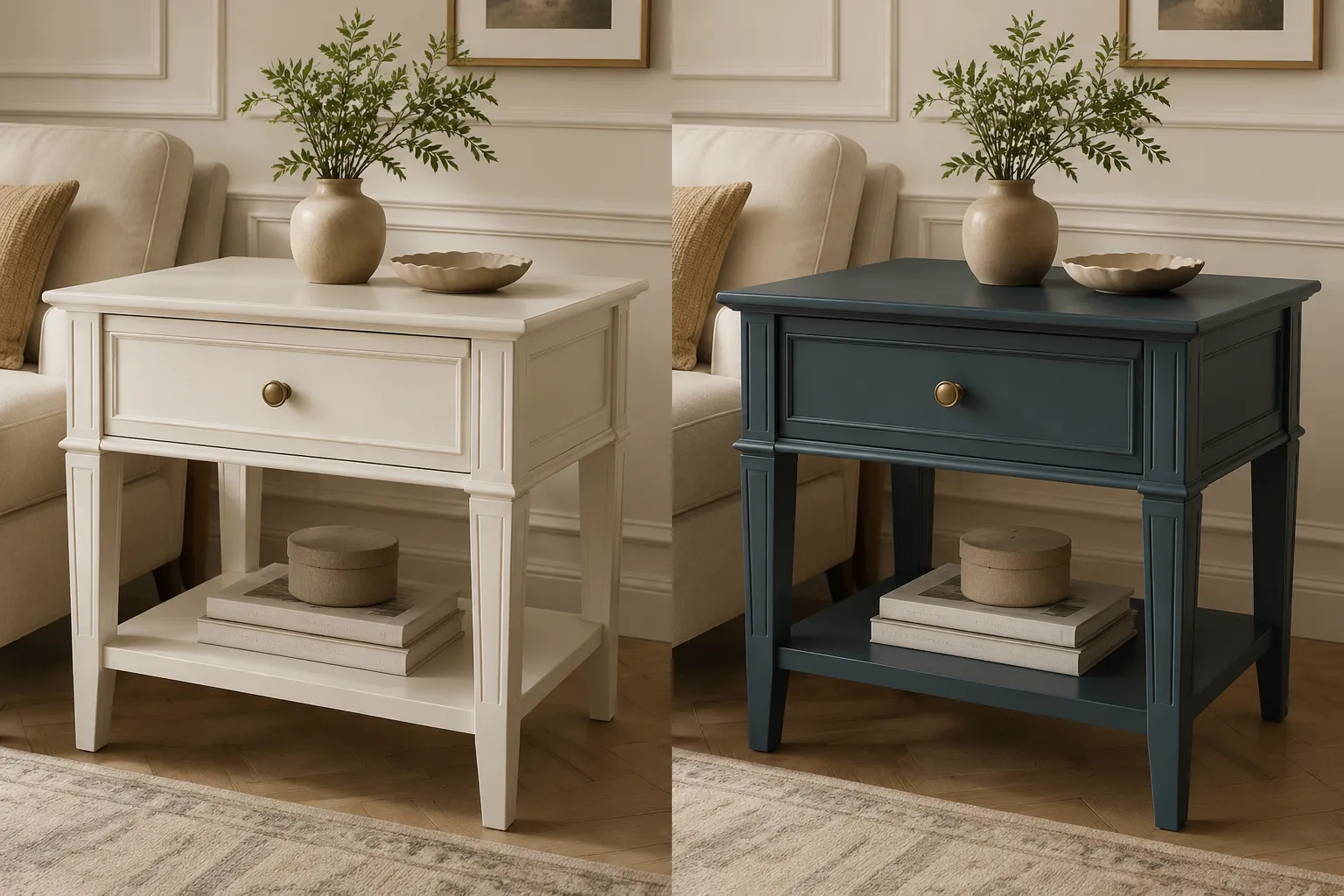
Room Context
Review both colorways in the same room context. Floor tone, wall color, nearby furniture, and reflected light can change how the painted surface is perceived.
The room view should answer a specific question:
- Which direction maintains the intended contrast with the floor?
- Which option supports the surrounding palette?
- Does either colorway become too close to the wall?
- Does the table remain visible beside adjacent furniture?
- Does the direction remain consistent with the collection?
Keep the room context stable while comparing. A separate styled scene may help later, but it should not replace the controlled comparison view.
Check Consistency Between Compared Views
Before discussing preference, compare the files for:
- Identical framing and object scale
- Matching camera perspective
- Matching exposure and contrast
- Matching shadow direction
- Matching background and floor response
- Consistent surface roughness assumptions
- Unchanged geometry and component placement
- Consistent crop and output size
The changed variable needs to remain easy to identify. If several variables change at once, record the comparison as unresolved and revise the brief.
The two views are comparable for color direction and room contrast. They are not suitable for judging sheen because the lighting and roughness assumptions are undocumented.
Separate Visible Cues From Unresolved Questions
Use three review labels so the image does not carry more authority than the project record supports.
Visible in the Render
These may include relative hue direction, apparent value, apparent saturation, silhouette readability, component contrast, edge highlights, shadow relationships, and room-context contrast.
Specified by the Brief
These include the intended color direction, finish assumption, unchanged components, room setting, comparison purpose, and required output views.
Still Inferred or Unverified
These include physical color reproduction, sheen, surface texture, coating thickness, durability, color shift under other lighting, production feasibility, and technical or regulatory outcomes.
Research on rendered objects, surface appearance, viewing conditions, and image fidelity supports this separation. It does not turn a convincing image into a physical finish record.
What to Request Before Finish Approval
Use the render to support a visual direction decision. The next request depends on what remains unresolved.
Request a physical material reference when the decision depends on hue, small value differences, saturation tolerance, sheen, surface texture, edge appearance, light response, or coordination with an existing painted component.
The reference record should identify the paint or finish system as far as the project requires. A material sample remains necessary when the image cannot settle the physical appearance.
Request a controlled lighting view when the two options change substantially under different illumination assumptions. Record the light source, viewing position, and surrounding context used for that review.
Request a production or technical handoff when the discussion moves into construction, coating process, assembly, installation, structural questions, electrical questions, regulatory requirements, or production readiness. The render can accompany that handoff, but it does not replace the relevant project record or qualified review.
Example Approval Note
For an example painted side-table comparison, the review record could state:
Colorway A provides stronger silhouette separation against the wall and keeps the lower shelf readable. Colorway B offers a warmer room relationship but appears heavier at the base. Both renders use the same camera, crop, room context, and shadow direction. The decision is limited to visual direction. A physical paint sample is required to confirm hue, sheen, and edge response before finish approval.
This note records an observable comparison, identifies the conditions, and names the unresolved physical question. It does not turn the render into a production specification.
Common Misunderstandings
“The more realistic render is the better color reference.”
Realism can improve visual communication, but appearance depends on the model, material assumptions, lighting, display, and viewing conditions. A realistic image still needs a physical reference when finish appearance affects approval.
“A side-by-side image proves the colors are different enough.”
It shows a difference under the selected conditions. It does not establish a universal threshold or confirm that the difference will remain visible on the finished table.
“The room view is only for presentation.”
Room context affects contrast and visual balance. Use it for a named review question while keeping a controlled comparison view available.
“Changing roughness is harmless if the color stays the same.”
Roughness and sheen assumptions can change highlights, apparent value, saturation, and edge response. When finish appearance is part of the decision, record that variable instead of treating it as incidental.
Final Review Sequence
- Lock the model, camera, crop, lighting, room context, and output settings.
- Name Colorway A and Colorway B by their intended visual directions.
- Compare hue, value, saturation, silhouette, component placement, edge response, and room context.
- Record what the render shows separately from what it only suggests.
- Check consistency between the compared views.
- Write one approval note with the selected direction or unresolved question.
- Request the material sample, controlled lighting view, production record, or qualified technical review required for the next decision.
The useful endpoint is a comparison that lets the team record one visual decision and identify the next missing piece of evidence.
Sources
- Color naming experiments using 2D and 3D rendered samples
- Recommended methods for conducting human factors experiments on the subjective evaluation of colour rendition
- Effects of Shape, Roughness and Gloss on the Perceived Reflectance of Colored Surfaces
- Visual equivalence: towards a new standard for image fidelity
- An aesthetic measurement method for matching colours in product design
- The Effects of Wooden Furniture Color, Floor Material, and Age on Design Evaluation, Visual Attention, and Emotions in Office Environments