
Comparing Furniture Silhouette and Stance Across Concept Views
For a useful furniture silhouette comparison, place each concept view against the same visual criteria: outline, proportion, profile, component placement, contact points, and scale cues.
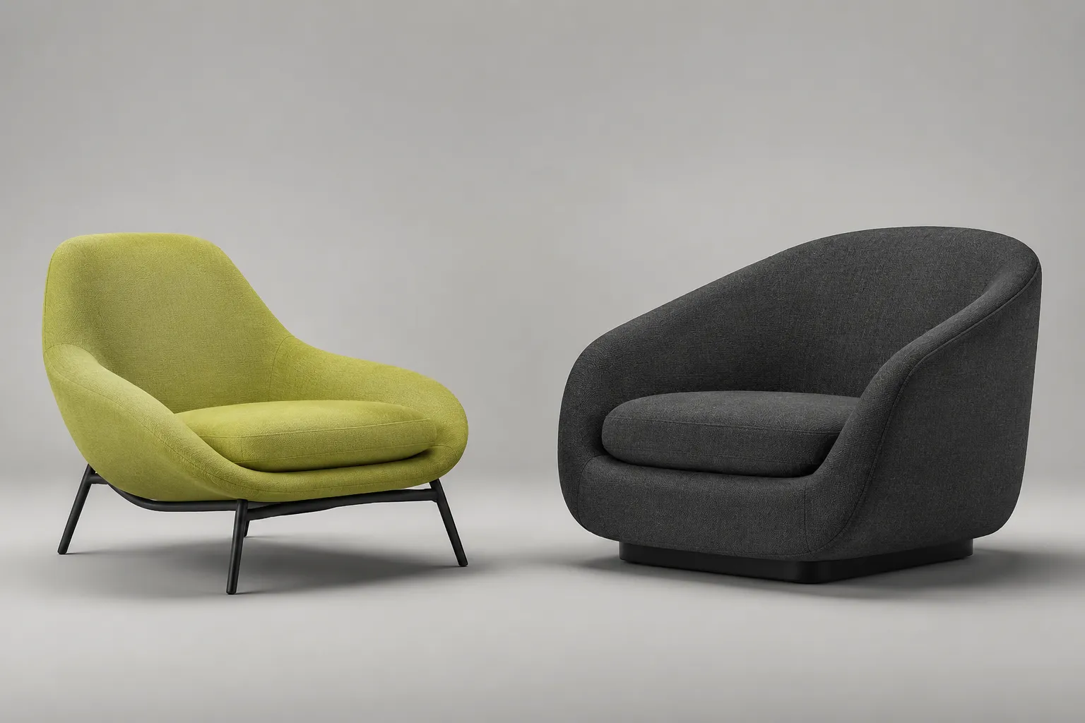
The closer direction is the one that matches the brief across those criteria, not the one that looks more polished in isolation. A lower seat line, heavier base, wider shoulder, or changed leg position can alter the perceived stance without changing the product category.
This comparison assumes consistent camera height, lens treatment, crop, scale reference, and lighting direction. When those conditions change, record the image difference separately from the furniture difference.
Start With the Overall Outline
Silhouette is the form read through its external outline. Begin with the views displayed at the same size, and reduce attention to finish detail before inspecting the outer contour.
- One direction has a wider shoulder.
- Another carries a more continuous curve from back to arm.
- One closes more of the space beneath the seat.
- The other exposes more of the supporting frame.
- One upper outline is more angular.
- One base occupies more visual area.
These statements describe what the render shows. They do not establish frame construction, load paths, or actual performance.
Direction A better matches the brief's open, light outline. Direction B reads as more enclosed because its side structure and base occupy more of the silhouette.
A verdict written this way can support an approval note or a focused revision request.
Compare Proportion Before Finish
Furniture proportion comparison becomes less reliable when colour, grain, sheen, or dramatic lighting dominates the image. Make the first pass in neutral lighting, or reduce finish treatment when finish is not the subject.
Compare the relationships between:
- Seat height and total height
- Seat depth and back height
- Base width and upper-body width
- Leg length and overall mass
- Arm thickness and seat width
- Shade diameter and lamp height
- Stem length and visible base diameter
- Component thickness and surrounding negative space
Research on product representation identifies size, thickness, dimensions, and proportion as recurring visual criteria when people compare parts. Those criteria can structure a review brief, but they do not replace a dimensioned drawing.
A lower seat line may make a chair appear more relaxed or grounded. A taller back may make the same chair appear more formal or vertically weighted. These are visual impressions, not conclusions about comfort, posture, or ergonomic performance.
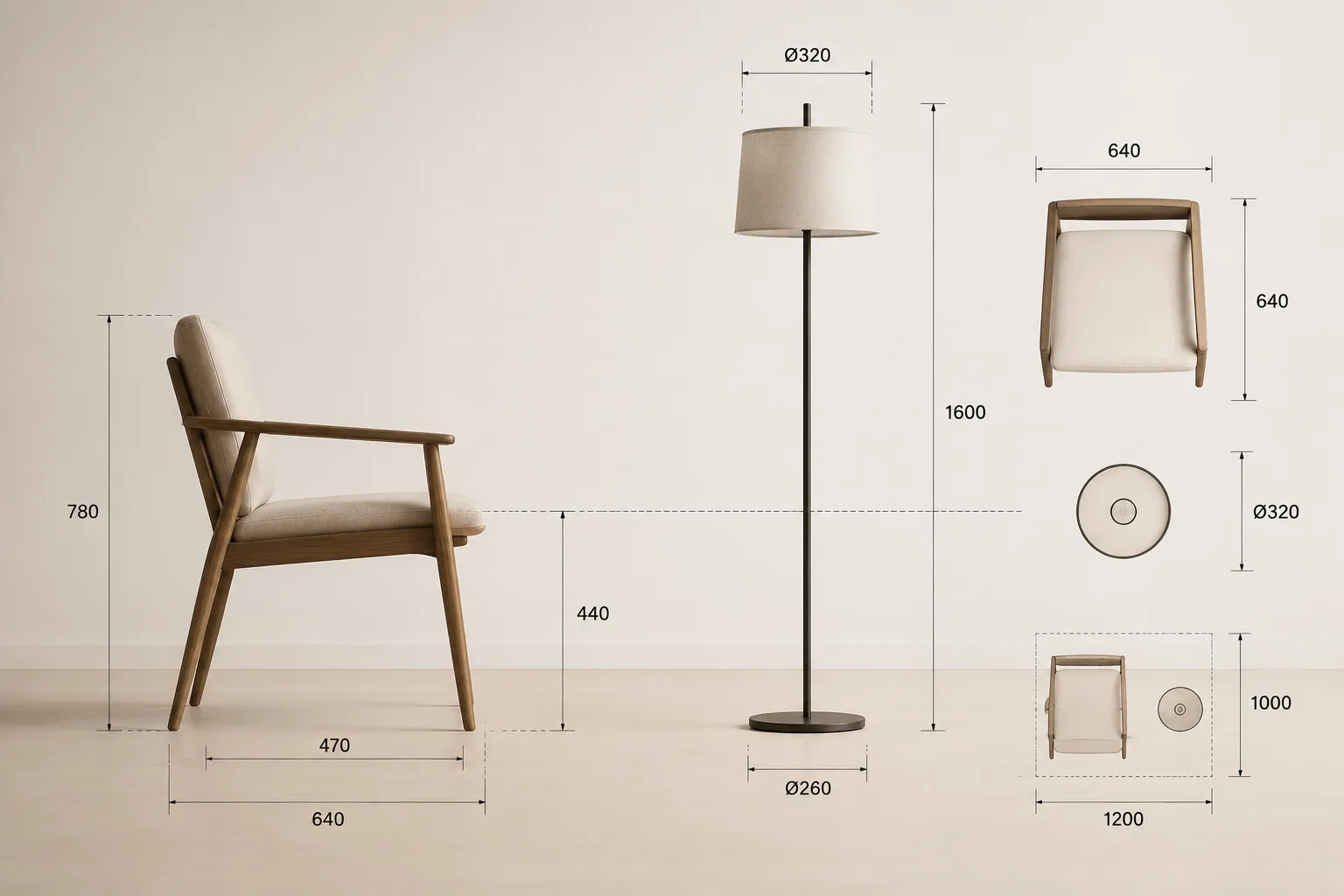
| Visible comparison | Brief implication |
|---|---|
| Lower seat line | Check whether the intended stance is relaxed rather than upright. |
| Heavier furniture base | Confirm whether visual solidity supports the collection direction. |
| Wider shoulder | Check whether the upper mass now dominates the room context. |
| Longer legs | Confirm whether the visual scale still matches the brief. |
| Thicker arms or frame | Review whether the outline remains open enough. |
| Larger lamp shade | Check whether the shade competes with the stem and base. |
Read Stance Through the Profile
Stance describes how an object appears to sit, rise, lean, spread, or meet the floor. Read it through several visible relationships rather than one isolated measurement.
For a chair or sofa, begin with the side profile. Compare the seat line, back angle, front and rear leg positions, arm trajectory, and distance between the body and floor.
For a table, inspect the relationship between the top, apron, central support, and feet. For a lamp, compare the base footprint, stem angle, shade position, and the visual weight below the light source.
- Where does the main mass sit?
- Which component establishes the vertical direction?
- Where does the object meet the floor or supporting surface?
- Does the profile agree with the brief's intended character?
The render may show a rearward-leaning back, a forward-set front leg, or a broad apparent contact area. It cannot confirm whether the actual object will remain stable, support a specified load, or perform safely in use.
Direction A has a lower visual centre and broader apparent contact points. Direction B rises more quickly from the floor and reads as lighter, but the intended balance requires confirmation in the dimensioned design.
Check Component Placement
Component placement often explains why two related concepts feel different. The category may remain unchanged while the relationship among seat, back, arms, legs, frame, shade, or stem shifts.
- Is the back centred over the seat?
- Are the legs aligned with the main mass or pushed toward the edges?
- Does the arm follow the seat line or rise above it?
- Is the base centred beneath the visual load?
- Does the lamp stem meet the shade on the same visual axis?
- Are supports visible, recessed, or hidden?
- Do adjacent parts create one continuous outline or separate visual units?
Research on design-information comparison treats shape, curvature, angularity, size, proportion, and component position as distinct cues. That supports a feature-level review rather than an unsupported statement that one concept is better.
Component placement can also affect collection consistency. Exposed rear legs may support an open, architectural direction, while a continuous enclosed plinth may support a heavier collection language. The comparison should refer to the stated collection brief, not a universal rule about furniture style.
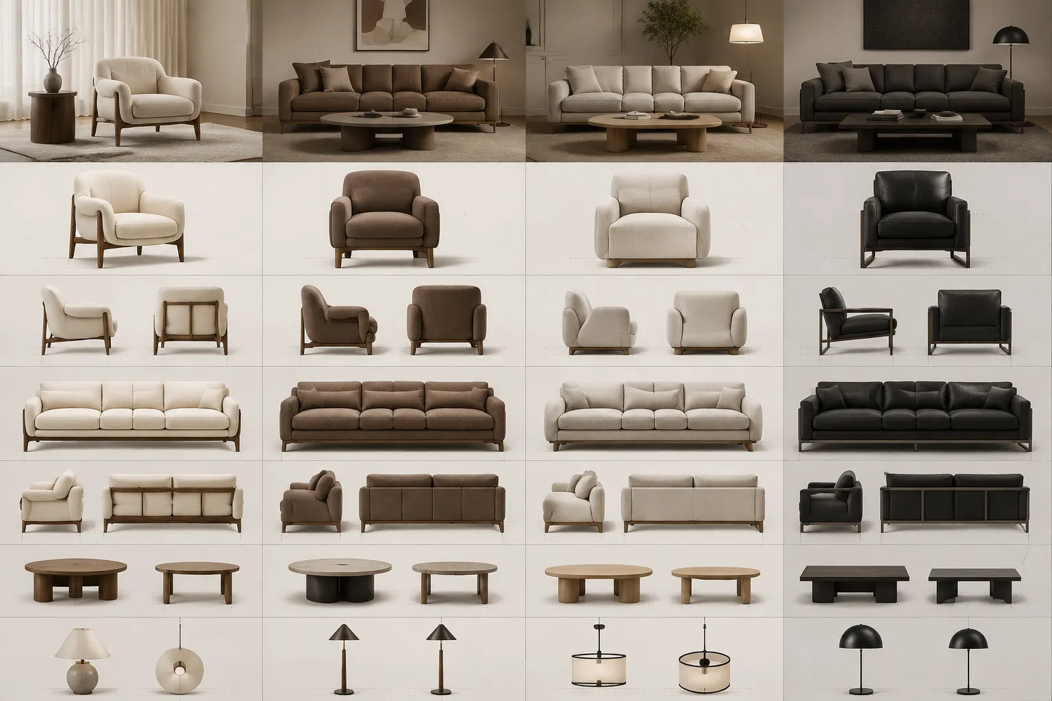
Use Contact Points as Scale Cues
Contact points are where the object appears to meet the floor, wall, table, or another supporting surface. They help the reviewer read stance and apparent scale.
- Number and spacing of visible legs
- Width of feet or base
- Distance between the lower frame and floor
- Alignment between the base and upper mass
- Shadow placement around the contact area
- Whether the object appears to float, rest, spread, or anchor
These cues depend on camera angle, floor visibility, shadow softness, and nearby objects. A dark shadow can make a narrow base appear wider, while a crop can hide the distance between supports.
Write the limitation beside the observation: “The base appears heavier because it extends across more of the lower outline. Confirm the intended footprint with a plan or dimensioned view before treating this as a technical comparison.”
Keep the Views Comparable
A furniture outline comparison needs controlled views. Before judging a design direction, confirm that the images share:
- Similar camera position and focal-length treatment
- Matching object scale within the frame
- Comparable crop and margin
- Consistent floor and room reference
- Comparable lighting direction
- The same finish variant, when finish is not the subject
- Identical or documented changes between versions
Perspective can exaggerate depth, leg spread, and front-to-back proportion. A close camera can enlarge the nearest arm or leg, while a low camera can strengthen the apparent height of the base or seat.
When the views are not controlled, separate the notes:
- Image condition: Direction B uses a lower camera and tighter crop.
- Furniture observation: The visible rear leg position differs from Direction A.
This keeps a rendering change from becoming an accidental design conclusion.
Compare Directions Against the Brief
Name the directions and criteria before assigning a preference.
| Criterion | Direction A | Direction B | Review consequence |
|---|---|---|---|
| Overall outline | More open beneath the seat | More enclosed lower body | A supports a lighter silhouette. |
| Seat line | Lower and more continuous | Higher with stronger separation from the base | B reads more upright. |
| Profile | Back curves gradually | Back changes angle more sharply | Confirm the intended degree of softness. |
| Component placement | Legs align near the outer edges | Legs sit further inward | A appears more spread at floor level. |
| Room context | Occupies less visual height | Creates a stronger vertical presence | Check against neighbouring pieces. |
If the brief specifies an open, low, visually relaxed chair, Direction A is the closer visual match. If it calls for a taller, more formal presence, Direction B may be better aligned.
The missing decision is the approved seat-height and profile reference. This is a design-direction judgment based on visible evidence, not a statement about comfort, stability, or production suitability.
Translate Reactions Into Brief Language
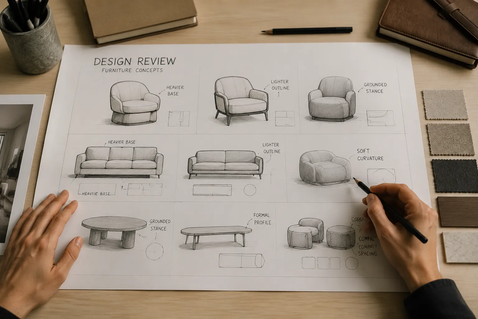
Words such as heavier, lighter, grounded, formal, soft, or tense are useful in a review room, but each needs a visible anchor.
| Reader language | Observable cue to record |
|---|---|
| Heavier | Greater lower mass, thicker members, reduced negative space, or a wider base. |
| Lighter | More exposed floor, thinner visible members, or more open spacing. |
| More grounded | Lower mass, broader apparent contact points, or a lower seat line. |
| More formal | Taller profile, stronger vertical axis, or less recline in the side view. |
| Softer | More continuous curvature, rounded transitions, or fewer sharp changes. |
| More compact | Shorter projection, reduced spread, or tighter component spacing. |
Studies of furniture form, style perception, and design similarity support this vocabulary as a way to describe visual cues within specific study contexts. They do not establish that every viewer interprets a form identically.
When reviewers disagree, ask each person to name the cue behind the reaction. “Too heavy” can become “the plinth extends beyond the seat width and closes the lower negative space.” That revision request can be acted upon.
What Concept Views Establish
Consistent concept views can support a decision about visible form direction. They may show relative silhouette, apparent massing, profile differences, component placement, contact-point arrangement, room-scale relationships, and broad finish differences.
They can support selecting a direction, requesting a revision, or documenting an approval condition. They cannot establish exact dimensions, material behaviour, structural capacity, stability, comfort, manufacturability, electrical requirements, installation requirements, standards compliance, test results, or reference rights status.
Display method also affects what a reviewer can judge. A static image does not provide the same evidence as a physical object or a documented dimensional view, especially for depth, rear construction, underside treatment, texture, sheen, or adjacent component relationships.
Request another view when the decision depends on one of those unresolved relationships.
Reference Selection and the Next Handoff
A documented museum collection can provide visual vocabulary and a stable reference object for form comparison. Record the specific object, available date or period, selected view, and feature being compared.
Use the reference to clarify a brief: “Compare the openness of the side profile with the selected reference object.” Do not use a historical object as validation that a new concept is technically valid, historically correct, or commercially suitable.
Reference status also needs its own record. A visual resemblance may guide discussion while leaving permitted use unresolved. Keep that question in the reference and rights handoff rather than folding it into the silhouette verdict.
For each direction, record the outline, proportion, profile, component placement, contact point, and scale cue. Then add two fields:
- Brief match: Which direction better matches the stated visual requirement?
- Next request: Which view, reference, sample, drawing, test record, or qualified review remains necessary?
For the example above, Direction A matches the brief through its lower seat line, open side profile, and wider apparent contact points. Request a dimensioned side view and base detail before making technical or production decisions.
Sources
- Furniture · V&A
- BIFMA Standards
- Simultaneous multimodal measures for aesthetic evaluation of furniture color and form
- A Study of Style Recognition and the Operation of Products in Which Ming-Style Chairs are Used as Examples
- Determination of Critical Design Variables Based on the Characteristics of Product Image/Impression: Case Study of Office Chair Design
- A Novel Approach for Predicting and Understanding Consumers' Sense of Design Similarity
- Comparing and Evaluating Human and Computationally Derived Representations of Non-Semantic Design Information