
Form and Proportion Direction Studies
A furniture form study gives a visual team a controlled way to compare shape before construction details dominate the conversation. The useful question is not which concept looks better alone. It is which direction matches the stated brief, remains coherent across views, and leaves the fewest important questions unresolved.
For furniture and lighting teams, that decision usually involves form, proportion, silhouette, stance, component placement, and room context. A concept render can make those cues visible while still hiding uncertainty behind camera choice, lighting, surface treatment, and perspective.
More specific pages
These pages continue the topic in smaller, more specific directions.
What the Study Needs to Establish
A furniture form study is an early visual comparison focused on the object's external organization. It may cover a chair, table, cabinet, shelving unit, sofa, pendant, wall light, or related product family. It does not need to settle every technical question. It needs to make the intended direction specific enough for review.
The brief should identify the differences the images are meant to expose. These may include:
- A compact or elongated overall mass
- A rectilinear or curving silhouette
- A light-looking or visually grounded stance
- Open or enclosed relationships between components
- A quiet outline or a more articulated edge condition
- A narrow, broad, tall, low, suspended, or floor-contacting presence
- A consistent relationship between primary and secondary components
The render shows the visible result of those instructions. It does not independently confirm the construction logic behind them. A cabinet may appear to have a floating top, recessed base, or thin supporting frame, but the load path, joining method, material thickness, and installation requirement remain separate questions for the relevant production or technical record.
Form, Proportion, Silhouette, and Stance
These terms overlap in ordinary design discussion, but each answers a different review question.
Form
Form describes the object as an organized three-dimensional presence. It includes the relationship between volumes, planes, curves, openings, edges, and component groups.
Ask which mass reads as primary, which elements attach or recede, whether the object appears open or enclosed, and whether the same organizing logic persists across the comparison views. The image can show apparent relationships between parts, but concealed structure and true thickness may remain unknown.
Proportion
Proportion concerns relative size. The question is how one dimension or component relates to another, rather than whether any single measurement is correct.
- Seat height against seat depth
- Leg length against the main body
- Top thickness against overall width
- Shade diameter against stem height
- Door width against cabinet height
- Void size against surrounding material
Relative judgment is more useful when the views share a scale cue, perspective, and reference condition. It remains a visual comparison, not a dimensional confirmation.
Silhouette
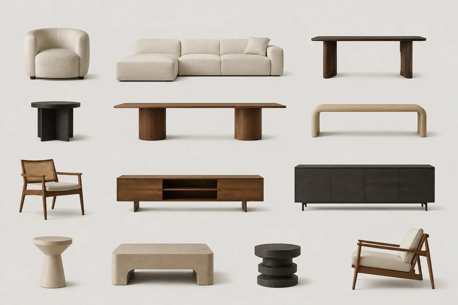
Silhouette is the outer contour read against its background. It is often the fastest way to identify whether two directions meaningfully differ.
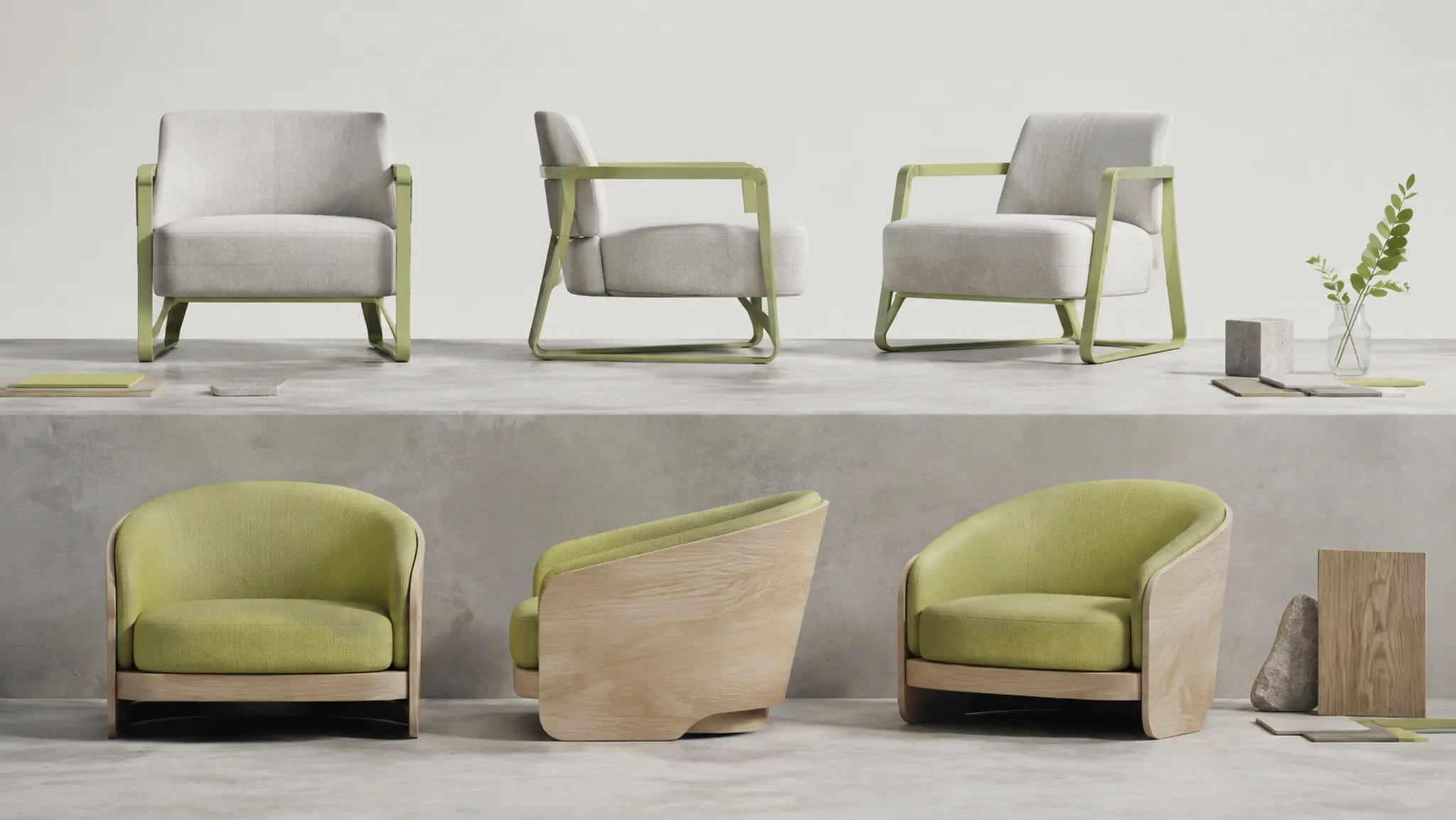
A furniture silhouette comparison should examine the highest and lowest points, the widest and narrowest zones, the angle of supports, the rhythm of repeated verticals or horizontals, the shape of negative spaces, and the outline from each requested view. One attractive three-quarter angle cannot carry the whole decision if the profile becomes heavy or unresolved.
Stance
Stance describes how the object appears to occupy space. It is suggested by contact points, support positions, verticals, offsets, lean, spread, and the distribution of visual mass.
Ask whether the product appears grounded, lifted, leaning, or suspended; whether contact points are legible; whether the support arrangement agrees across views; and whether the apparent center of mass conflicts with the brief. These are visual observations. They do not establish structural stability, safe use, or installation suitability.
Start With the Ambiguity
A request such as “make it lighter” can refer to a slimmer silhouette, more open negative space, a paler finish, a higher support position, or a smaller room footprint. Before commissioning another image, name the cue that should change.
| Review phrase | Possible visual meaning | Confirmation needed |
|---|---|---|
| Lighter | Thinner members, more void, a pale finish, or an elevated stance | Which cue should change? |
| Softer | A curved outline, rounded edges, upholstery, or lower contrast | Is the concern form, finish, or atmosphere? |
| More substantial | Larger volume, thicker edges, darker finish, or a closer camera | Which dimension or relationship matters? |
| More elegant | Narrower proportions, fewer interruptions, longer lines, or quieter detailing | Which visible criteria define the direction? |
| More architectural | Stronger planes, clearer geometry, sharper joints, or a larger room relationship | Is the product or the setting carrying the effect? |
Convert the chosen interpretation into an observable criterion. “Reduce the visual weight of the base” is more reviewable than “make the base feel lighter.” The comparison can then be judged against the intended change.
Comparing Furniture Concept Views
A useful comparison keeps the variables stable enough for differences to be read. Camera distance, background value, floor relationship, lighting direction, crop, and scale cue can all influence perception.
- Front view: width, symmetry, component alignment, and face treatment
- Side view: depth, lean, overhang, and profile
- Three-quarter view: volume, overlap, and relationships between planes
- Rear or underside view: support, mounting, or back treatment when those affect the direction
- Room-context view: scale, spacing, and collection relationship
- Detail view: edge response, junctions, translucency, weave, grain, or surface contrast
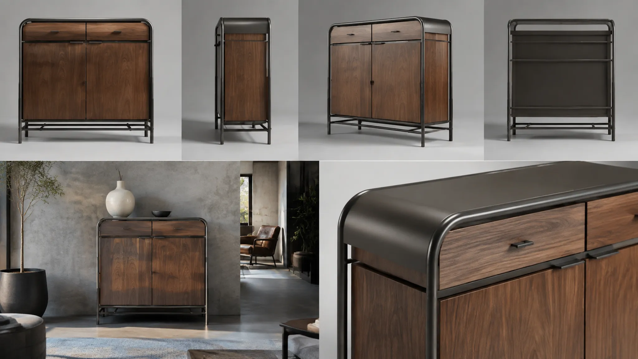
Research comparing rendered images, rotating views, virtual displays, and physical interaction indicates that judgments about shape, texture, finish, and appeal can vary by presentation mode. Use a still render for a still-image comparison. Request additional views when the decision depends on movement around the object or on a concealed side.
A view is useful when it answers a named question. Extra views that introduce new camera conditions without a decision purpose can make the review less consistent.
A Criteria Matrix for Form and Proportion
A matrix keeps the discussion tied to comparison criteria rather than personal preference. It also records where the images are too limited to decide.
| Criterion | Direction A | Direction B | Still unresolved |
|---|---|---|---|
| Overall mass | Compact, concentrated body | Longer, more distributed body | Actual envelope and tolerances |
| Silhouette | Quiet outer contour | More articulated contour | Rear and underside behavior |
| Proportion | Shorter support-to-body relationship | Taller support-to-body relationship | Confirmed dimensions and scale |
| Stance | Broad visual footprint | Narrower visual footprint | Contact details and structural review |
| Component placement | Secondary elements recede | Secondary elements become prominent | Joining and assembly logic |
| Room context | Reads as a focal object | Integrates with surrounding pieces | Tested room layout |
| Finish response | Form depends on low contrast | Form depends on stronger contrast | Material sample and lighting condition |
Describe what the views show, not what the team hopes the product will achieve. “Feels more premium” is difficult to audit. “The darker edge increases the apparent separation between top and support” gives the next reviewer something concrete to inspect.
Review Checkpoints
Outer contour first
Start with a neutral background and a consistent view. Reduce attention to material, color, and room styling while checking where the contour changes direction, whether the main parts form a clear hierarchy, and whether negative spaces remain intentional.
If one direction depends on dramatic light or a close crop to read well, record that dependency. The direction may still be useful, but the approval note should identify the condition.
Relative weight second
Compare the size and visual density of related parts. A thin top over a dense base reads differently from a thick top over widely spaced supports, even when the overall dimensions are similar.
Note which component dominates first, where the eye pauses, and whether the mass moves upward, downward, inward, or outward. A finish change can alter apparent weight, so isolate the finish variable before revising the form brief.
Contact points third
Feet on the floor, bases against a surface, wall mounts, ceiling connections, and visible junctions act as visual anchors. Check whether they appear in the same locations across views and whether shadows obscure an important connection.
The render can identify a missing or inconsistent contact point. Installation method, load capacity, electrical arrangement, and construction detail require the appropriate technical record.
Room context last
A product may look proportionate alone but become too dominant beside related pieces. Conversely, a compact object may lose its intended presence in a large room.
Use context views to compare nearby heights, circulation or display zones, collection lines, architectural elements, and finish boundaries. Context supports visual placement; it does not replace a measured layout, specification record, or installation review.
What Changes the Answer
When silhouette is the priority
Use front, side, and three-quarter views with comparable framing. Keep material variation restrained until the contour has been reviewed. A strong direction keeps its intended outline legible across the requested views; one that works from only one angle needs a narrower brief or another view.
When proportion is the priority
Use a shared scale cue and identify the relationships under review. A human figure, architectural opening, standard room element, or documented product dimension may serve as a cue, but its source and status should be recorded.
Perspective can make one concept appear larger because it sits closer to the camera. Matched comparison conditions are required before interpreting that difference.
When stance is the priority
Show the floor, wall, ceiling, or supporting surface. Include enough context to reveal the object's visual footprint. A narrow support arrangement may create an elevated reading, while a broad base may create a grounded one. Structural confirmation belongs to a later technical handoff.
When collection consistency is the priority
Compare multiple products using the same criteria. Look for shared angles, edge language, support logic, opening proportions, and finish relationships. A collection board can show that one product introduces a new visual rule, but visual consistency does not establish technical compatibility.
Common Mix-Ups
Form versus finish
A darker finish can make a volume appear denser, while gloss can sharpen an edge and a pale surface can reduce contrast. Before changing the form, isolate the finish variable. If the silhouette remains heavy in a neutral presentation, the issue may belong in the proportion or component brief.
Proportion versus camera
A low camera can exaggerate height, a close crop can enlarge a compact product, and a wide lens can alter relationships near the frame edges. When the team disagrees about proportion, compare the concepts under matched camera conditions and record any remaining limitation.
Silhouette versus detail
Seams, grain, perforations, hardware, and decorative elements can draw attention away from the outline. Review the main silhouette before approving surface articulation. A detail pass does not resolve an unclear body, base, or support relationship.
Stance versus structural confidence
Shadow, dark values, or a broad visual base can make a product look grounded. A hidden, offset, or disconnected support can create the opposite reading. Use the image to identify the intended stance and its visual contradictions, then send the physical question to the relevant designer, engineer, maker, or producer.
Visual quality versus downstream readiness
Consistent lighting, clean edges, and convincing material cues improve communication. They do not demonstrate construction, exact material behavior, safety, compliance, installation suitability, rights status, or commercial response. The review note should state what the image supports and what it leaves for another record.
A Review Workflow for Ambiguous Directions
-
State the decision
Write one sentence that defines the comparison, such as a compact grounded base against a taller open base, or a quiet rectilinear silhouette against a softened continuous curve. Use that sentence as the reference point for later comments.
-
Lock the comparison conditions
Record the view, crop, scale cue, background, room context, finish state, and version identifier. Use the same conditions for both directions where direct comparison is required.
-
Mark visible evidence
Write observations such as “The side view shows a deeper overhang” or “The front view shows unequal spacing between supports.” Keep observation separate from interpretation.
-
Record the interpretation
The same cue can support different readings. A wide base may suggest visual weight, stability, or a need for more floor clearance. Record the intended reading and the alternative reading when either affects the decision.
-
Identify the missing confirmation
Replace “needs more detail” with a defined request: another side view, a dimensioned drawing, a material sample, a finish reference, a room measurement, a mounting detail, a source record, or qualified technical review.
-
Issue the approval note
Identify the selected direction or remaining choice, the criteria that determined it, the supporting view, unresolved questions, responsible handoffs, and the version being carried forward.
Material and Finish Questions
Material cues influence how form and proportion are read. Grain direction can reinforce length, a reflective surface can sharpen or obscure an edge, textile weave can add visual density, and translucency can make a panel appear thinner than its construction suggests.
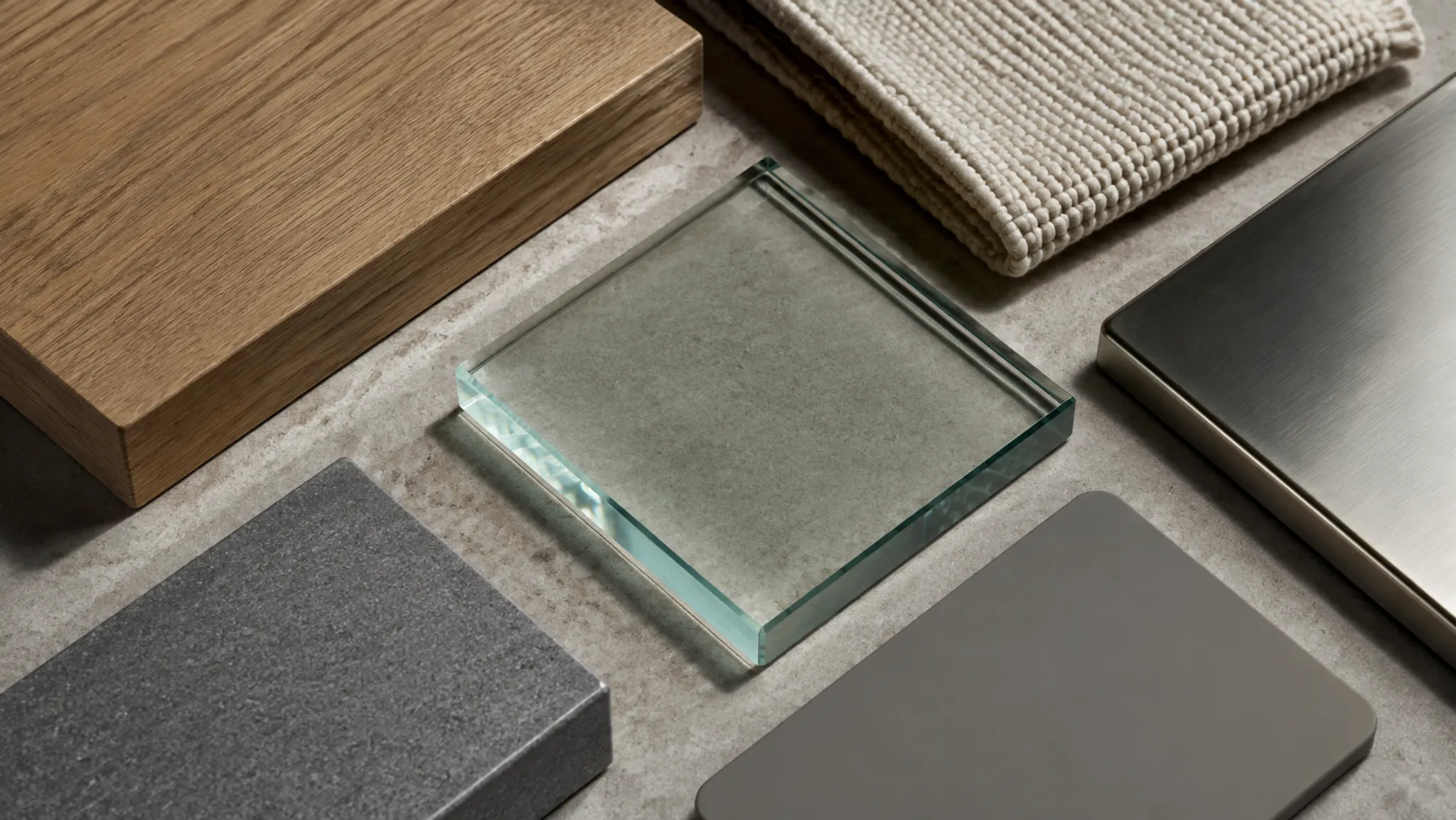
A render may show relative color and value, apparent roughness or sheen, directional grain or weave, transparency as a visual effect, contrast between adjacent components, edge response under chosen lighting, and differences between finish variants.
A material sample is still needed when the decision depends on tactile behavior, exact color, changing light, durability, joining, or production variation. Keep the material question attached to the form question: does the finish reinforce a long horizontal proportion, obscure a recessed joint, or make a thin support disappear? Performance and specification require the relevant material or production record.
Reference Records and Rights Status
A reference image can establish a visual direction, but its role should be documented. Record the feature being referenced, whether it concerns form, proportion, finish, context, or detail, along with the source, version, permitted-use status, comparison limits, and adaptations made.
“Use the reference” is less useful than “retain the broad shoulder-to-base relationship while changing the edge treatment.” Visual similarity alone does not establish rights status. That determination belongs in the appropriate record and review process.
When the Render Is Enough for the Next Decision
A concept view may be sufficient to select a direction when the requested difference is visible from the required angles, comparison conditions are consistent, the brief names the criteria, the main components remain legible, and unresolved questions have been recorded.
It is not sufficient when the decision depends on hidden structure, unshown silhouette changes, obscured contact points, material identity, unreliable scale cues, performance, compliance, installation, or an incomplete reference record. The image can support a direction decision while leaving those questions open.
A Worked Comparison
Consider two concept views for a pendant light intended for a dining setting. Direction A uses a broad, shallow shade with a short central stem. Direction B uses a narrower shade with a longer stem and a more visible lower component.
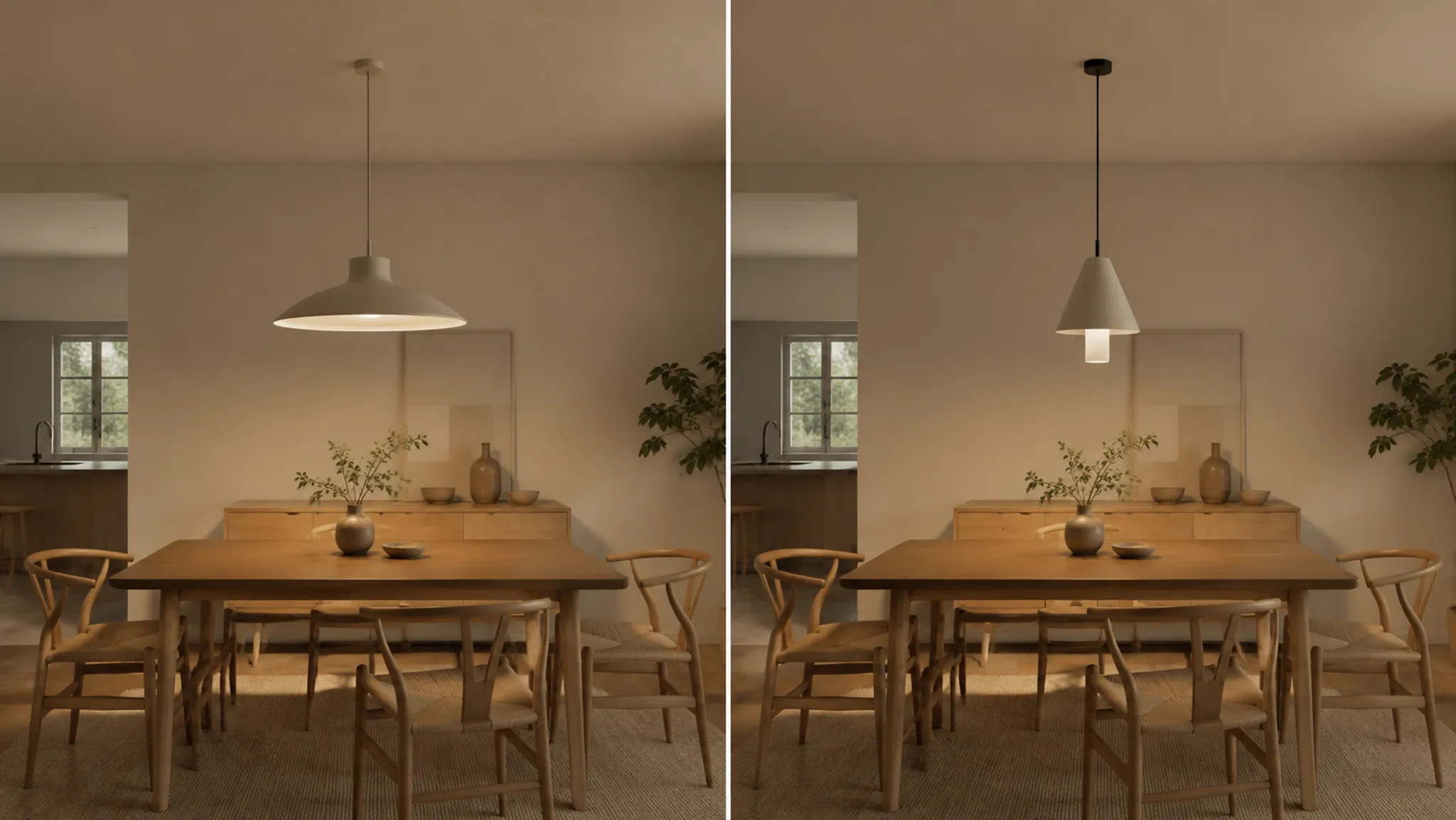
The front view shows a wider horizontal silhouette in Direction A and a stronger vertical reading in Direction B. The three-quarter view shows more concealed central assembly in Direction A, while Direction B makes component placement part of the visual identity.
The brief now needs to resolve three points:
- Is the intended direction broad and architectural, or narrow and vertical?
- Should the central component recede or remain visible?
- What relationship between shade height and dining surface must the room view expose?
The render supports a form and proportion comparison and suggests different visual stances within the room. Mounting, electrical arrangement, heat behavior, structural performance, and code questions move to the relevant technical and production participants.
Product-Family Checkpoints
Individual product
- The primary mass is legible.
- The silhouette matches the selected direction.
- The proportion relationships are stated.
- The stance is visible from the required views.
- Component placement remains consistent.
- Finish variants do not obscure the form decision.
- Unresolved technical and production questions are listed.
Collection
- Shared visual rules are named.
- Exceptions are deliberate and documented.
- Scale relationships remain credible across products.
- Supports, edges, openings, and mounting cues do not conflict visually.
- Room-context views use comparable conditions.
- Each product has an appropriate specialist handoff.
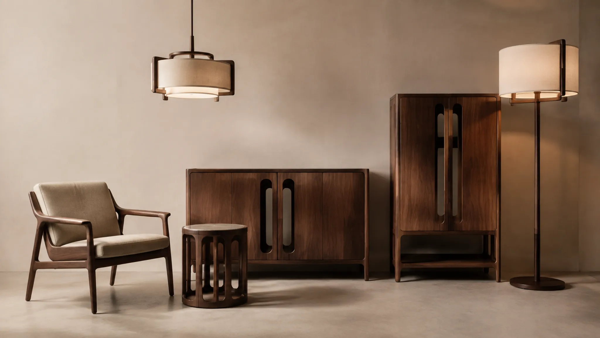
A collection board should organize decisions, not imply that visual consistency resolves technical compatibility.
Questions for the Next Handoff
For a designer, ask which contour or proportion is intentional, which component should carry emphasis, which views are required, and which reference controls the disputed relationship.
For a maker or manufacturer, identify apparent junctions, thin or curved parts, provisional dimensions, and the material sample that should be compared with the image.
For an engineer or technical reviewer, identify support, mounting, contact, clearance, or specification questions that sit outside image review.
For a rights or legal reviewer, identify reference records requiring verification, intended use for each supplied image, and adapted features needing separate documentation.
The handoff is stronger when each question names the source or record needed for resolution.
FAQ
What is a furniture form study?
It is a focused visual study of a product's form, proportion, silhouette, component placement, and stance. Its purpose is to make an early direction reviewable across controlled concept views.
How does it differ from a final product render?
A form study concentrates on comparison and direction. A polished presentation image may communicate a settled visual treatment, but it does not independently verify construction, material behavior, performance, compliance, installation, or rights status.
How many views should a concept comparison include?
The number depends on the decision. Front, side, and three-quarter views are useful when silhouette and proportion change across orientation. Add rear, underside, detail, or room-context views only when they answer a named question.
Can a render confirm furniture proportions?
It can support relative visual comparison when the views use suitable scale cues and consistent conditions. It cannot replace a dimensioned drawing or establish physical suitability.
When is a material sample needed?
A sample is needed when the decision depends on tactile quality, exact color, grain, weave, translucency, sheen, edge response, durability, or variation under actual lighting.
What should an approval note contain?
It should identify the selected direction, comparison criteria, supporting views, unresolved questions, responsible handoffs, and the version being carried forward.
The Decision to Carry Forward
A strong furniture form study ends with a documented direction rather than a broad aesthetic preference. State which form and proportion direction continues, which silhouette and stance cues define it, and which view supports the decision.
Record the conditional brief requirement, unresolved construction or material questions, reference status, and next specialist or narrower workflow. The render shows a direction. The brief specifies the criteria. The reference record identifies the source and version. A sample, drawing, technical review, or rights record supplies confirmation that imagery cannot provide.
Sources
- Perceiving Design Features in New Interaction Environments: Comparing Rendered Images, 360° Rotation, AR, Immersive and Non-Immersive VR, and Real Product Interaction
- An Intelligent Optimization Design Method for Furniture Form Considering Multi-Dimensional User Affective Requirements
- Simultaneous multimodal measures for aesthetic evaluation of furniture color and form
- Application of Comprehensive Evaluation in New-Product-Development Evaluation: The Case of Landscape-Architectural Outdoor Wooden Furnishing
- Using Augmented Reality Technology to Construct a Wood Furniture Sampling Platform for Designers and Sample Makers to Narrow the Gap between Judgment and Prototype