
Is a Collection Outlier Intentional or Inconsistent?
A collection outlier is more likely to be intentional when it changes one visible relationship while preserving the collection’s underlying visual logic. It is more likely to be inconsistent when several shared relationships disappear without a documented reason.
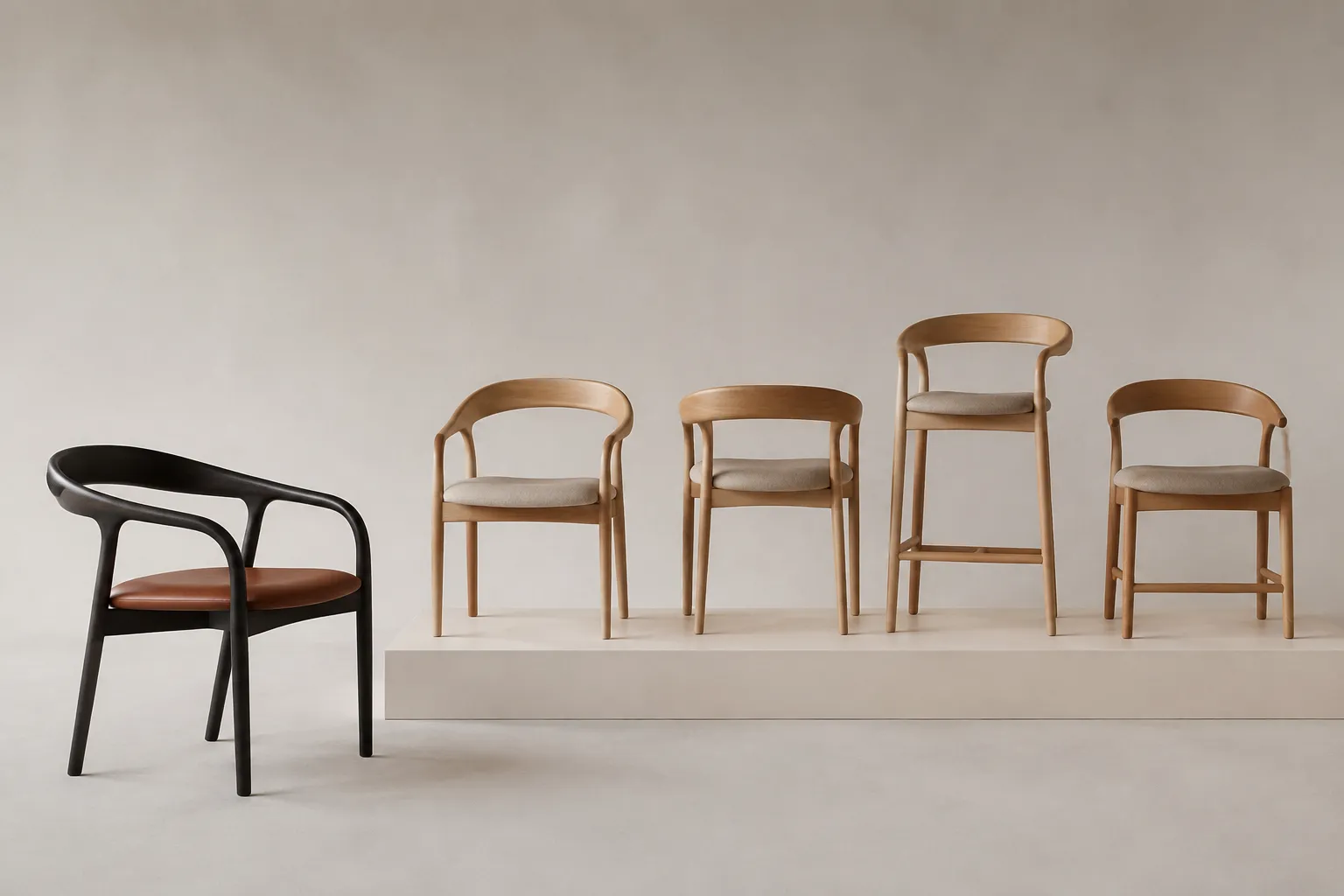
A realistic render cannot establish that distinction on its own. It shows form, proportion, component placement, finish cues, and room context. The brief, reference record, material sample, or qualified technical review must confirm what the image leaves unresolved.
Begin with a side-by-side comparison. Place the outlier beside two or three representative collection members, then record which relationships remain connected and which ones change.
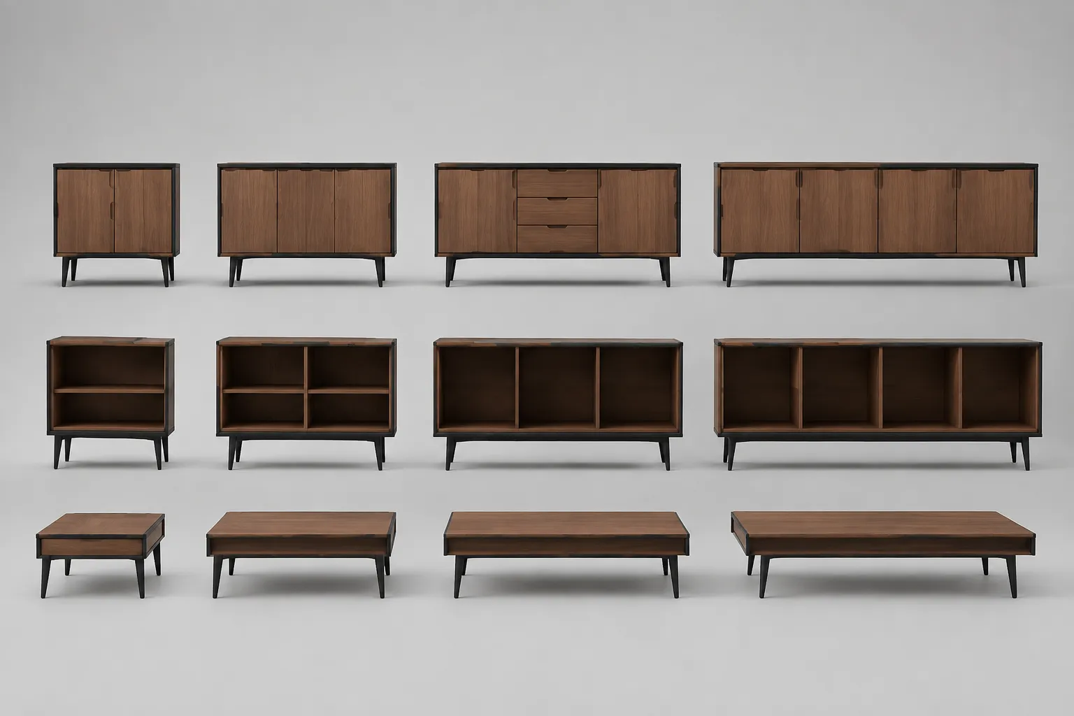
What Makes an Outlier Feel Intentional?
An intentional furniture contrast usually has a legible reason for departing from the collection. The departure may concern silhouette, scale, material emphasis, or component placement, while other relationships continue to support family resemblance.
For example, a collection may use a repeated edge profile and warm timber finish. One lounge chair may introduce a deeper curve and darker upholstery while retaining the same leg position, visual weight, and seat-to-back proportion. That pattern supports a review question, but it does not prove design intent.
Is the contrast limited to the approved aspect, or does it change the collection’s entire visual language?
The brief should identify the approved aspect directly. “Make the chair more distinctive” is difficult to review. “Retain the collection’s leg placement and edge response, but introduce a deeper back curve” gives the team a usable comparison point.
What Makes an Outlier Feel Inconsistent?
An outlier becomes harder to defend when several shared relationships change at once. Useful warning signs include:
- A different silhouette with no repeated detail connecting it to the collection
- A proportion that changes the object’s visual weight or apparent scale
- Component placement that conflicts with related products
- A finish whose sheen, roughness, grain, weave, or translucency has no reference record
- A scale cue that suggests a different room role or use
- A lighting fixture whose mounting, shade proportion, or light-emitting form conflicts with the family
- A different visual rhythm without an approval note explaining the departure
These signs do not establish inconsistency as a universal rule. They show where the review record is incomplete. One deliberate change can read as contrast; several unrecorded changes can read as mismatch.
Compare the Outlier Against Named Criteria
A useful furniture collection coherence review describes recurring aspects before judging the exception. The same method applies to lighting families.
Silhouette
Compare the outer contour from the same view and at an approximate matching scale. Note whether the outlier preserves a familiar stance, taper, curvature, or mass distribution.
A new silhouette may be intentional if the collection brief allows a sculptural accent. It requires confirmation if the outlier changes the family from compact and rectilinear to soft and expansive without a stated direction.
Proportion
Check relationships between major dimensions rather than judging size in isolation. For furniture, compare seat depth to back height, top thickness to overall width, or leg height to the body. For lighting, compare shade diameter, stem length, canopy scale, and overall fixture height.
If the outlier appears too heavy, delicate, or tall, identify the relationship causing that impression. Request a comparison view using the same camera position and scale cue. Relative shape and proportion checks can support discussion, but they do not establish design intent from an image.
Component Placement
Repeated details often carry family resemblance more reliably than broad style labels. Compare handles, seams, supports, feet, shade openings, switches, brackets, joints, and contact points.
An outlier may use a new component if its placement follows an existing alignment or rhythm. A component that appears arbitrary, even when the overall silhouette is similar, deserves a brief revision or reference check.
Scale Cues and Room Context
Room context can change the reading of an outlier. A chair may appear coherent in an isolated product view but oversized beside the collection’s tables. A pendant may share a finish with the family but overwhelm the intended room grouping.
Review the outlier with representative products in the same room context. Consider pairwise relationships, group relationships, the clearances shown, and the visual balance of the complete arrangement.
This check concerns appearance and spatial relationships only. It does not confirm ergonomic suitability, installation requirements, structural capacity, or electrical performance.
Material and Finish Continuity
The render may suggest continuity through color, grain, weave, roughness, translucency, or sheen. It cannot establish an exact material or finish match.
Compare the visible finish behavior with the approved reference record. Ask whether the difference is a deliberate finish variant or an unresolved visualization choice. A material sample is still needed when edge response, translucency, surface texture, or color under specified lighting affects approval.

Intentional Contrast Versus Inconsistent Element
| Review question | Possible intentional contrast | Possible inconsistency |
|---|---|---|
| What changes? | One named aspect, such as silhouette or finish | Several aspects change together |
| What remains? | Proportion, alignment, rhythm, or component relationship | Few recognizable collection relationships remain |
| What does the brief specify? | A defined contrast or role within the family | No direction or reference explains the departure |
| What does room context show? | A distinct but supported role | The object competes with or disrupts the group |
| What happens next? | Record the approved exception | Request a revised brief or comparison view |
Use this table as a documentation aid, not as a scoring system. Reviewers may prefer different directions. The purpose is to make the disagreement specific enough to resolve.
What the Render Can and Cannot Establish
The render can help the team compare:
- Silhouette and apparent visual weight
- Proportion and relative scale
- Component placement and repeated details
- Visual rhythm and finish cues under the shown lighting
- Relationships to nearby collection members
- Relationships to the room context shown
It cannot establish:
- Construction quality or manufacturability
- Structural or electrical performance
- Safety, installation, or code requirements
- Exact material behavior or finish reproduction
- Rights status for reference imagery
- Production tolerances, retail performance, or customer response
Separate the visual decision from the technical decision. The collection review can identify the question; it cannot answer specialist questions by appearance alone.
A Compact Collection Outlier Review
Use one comparison view with the outlier and representative products. Keep the camera angle, crop, scale cue, and room context as consistent as possible.
Write four short notes:
- Visible: What does the render show?
- Compared: Which collection relationships remain or disappear?
- Specified: What does the brief or reference record identify?
- Unresolved: What requires a sample, technical record, or qualified review?
For example:
The render shows a taller back, darker upholstery, and relocated rear legs. The outlier retains the collection’s rounded edge response but changes proportion and component placement. The brief specifies a darker finish variant but does not mention the revised leg position. Request a comparison view with the approved leg arrangement before treating the difference as intentional.
This format keeps preference language connected to observable evidence.
When to Revise the Brief
Revise the brief when reviewers agree that the outlier should differ but cannot agree on the permitted difference. Specify:
- The collection relationships that must remain
- The single contrast the outlier is meant to introduce
- The representative products for comparison
- The intended room role
- The finish or material reference
- The approval view required for review
Describe a visual decision rather than a vague quality judgment. “Restore family resemblance” is less useful than “retain the shared leg alignment and reduce the shade diameter to match the collection comparison view.”
When to Hand Off the Decision
Move beyond visual review when the outlier raises questions about construction, material behavior, production, safety, installation, compliance, or rights.
A production or technical participant may need the latest drawings, dimensions, material specifications, assembly information, or applicable requirements. A material sample may be needed to compare finish behavior, and a rights review may be needed for references used during visual development.
Final Decision
Record the outlier as an intentional contrast when the brief or approval record names the departure and the comparison shows enough remaining collection logic to support it.
Record it as inconsistent when multiple relationships conflict, no documented purpose explains the changes, or the comparison view exposes a mismatch that the current brief does not address.
Choose one next action: approve the named contrast, revise the brief, request a controlled comparison view, confirm the reference record, obtain a material sample, or send the unresolved issue to qualified production or technical review.
Sources
- Constructing a Design Space from a Collection of Design Examples
- Using Augmented Reality Technology to Construct a Wood Furniture Sampling Platform for Designers and Sample Makers to Narrow the Gap between Judgment and Prototype
- An interactive system for efficient 3D furniture arrangement
- fCrit: A Visual Explanation System for Furniture Design Creative Support