
Material and Finish Direction Comparisons
A material render comparison helps a team choose between visible directions before sampling, construction coordination, or production review. It becomes less useful when several decisions collapse into one impression: “warmer,” “more natural,” “higher quality,” or “closer to the reference.”
Furniture and lighting teams need a more specific comparison. Does the grain scale suit the form? Does the finish read consistently across components? Does the surface support the intended room context? Does the image show a deliberate direction, or only a convincing texture?
The render can expose these questions. It cannot settle every one. A reviewable comparison separates what the image shows from what the brief specifies, what the reference record supports, and what still requires a sample or qualified production review.
More specific pages
These pages continue the topic in smaller, more specific directions.
What Changes the Result of a Material Render Comparison?
The answer changes with the object, the viewing purpose, and the reference used for comparison. A close product view may prioritise grain direction, edge response, and sheen. A room-context view may prioritise proportion, contrast, reflections, and collection consistency.
Before comparing two directions, record five inputs:
- The furniture or lighting form under review
- The component or surface receiving the material
- The reference image, sample, specification, or finish record
- The intended viewing distance and room context
- The decision the comparison must support
A collection board does not need the same comparison structure as a close review of veneer direction with a maker. The first may need family-level consistency. The second may need views of panels, edges, joints, and component placement.
Separate material direction from finish direction. Material direction concerns the represented surface identity, such as wood, stone, textile, glass, ceramic, or metal. Finish direction concerns colour, roughness, sheen, translucency, coating appearance, and surface variation. These variables interact, but they should not be approved as one undifferentiated choice.
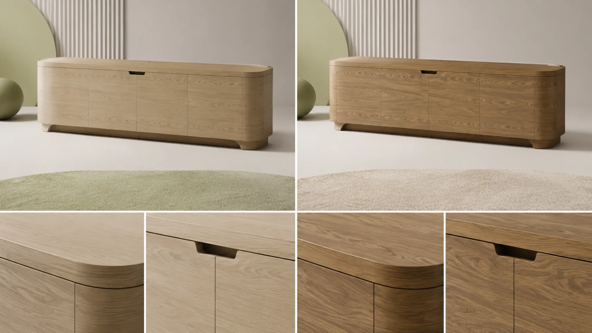
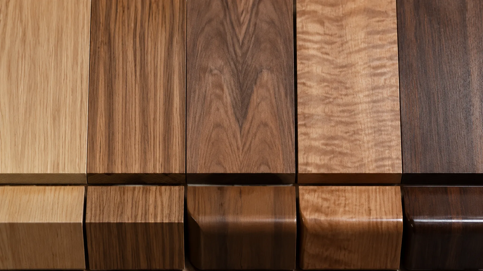
Material Direction Versus Finish Direction
Material direction asks what surface or material identity is being represented. Finish direction asks how that surface should appear under the chosen lighting and viewing conditions.
Two renders may represent the same apparent wood material while comparing a lighter colour, quieter grain, higher sheen, different grain scale, or a different direction across panels. The visible difference may look like a material change even when the comparison concerns finish appearance. A change in species or veneer structure may also be disguised by similar colour and lighting.
Use separate approval notes for:
- Material identity: the intended species, veneer, textile, metal, glass, ceramic, or polymer reference
- Pattern and direction: grain, weave, repeat, orientation, or placement across components
- Surface response: roughness, gloss, translucency, edge response, and reflections
- Colour and tone: the visible colour relationship within the agreed viewing setup
- Context: the room, floor, wall, lighting, and surrounding objects affecting perception
The render shows appearance under a particular setup. It does not establish physical build-up, finish chemistry, durability, movement behaviour, or production suitability.
Reviewing Wood Grain Scale in Furniture Renders
Wood grain scale comparison is more useful as a proportion and composition question than as a texture-quality score.
A large pattern may dominate a small drawer front or narrow leg. A fine pattern may become visually inactive across a broad cabinet side. Repetition can also become prominent when one texture is distributed across several components without enough variation.
Compare grain scale against the form and the intended viewing distance:
- Does the grain remain legible at the planned viewing distance?
- Does its scale suit the width and height of the component?
- Does repetition become visible across adjacent faces?
- Does the pattern compete with the silhouette or hardware?
- Does the scale remain coherent in room context?
Research on computer-visualised interior wood has discussed repetition, scale, lighting, reflections, composition, and room context as factors in how observers read the image. That supports a review framework, not one universally preferred grain scale.
The larger grain gives the cabinet more visible activity, but the repeat becomes prominent across the paired doors. Compare a quieter scale on the doors while retaining variation on the side panels.
This kind of note records an observable relationship. It avoids treating “natural” or “premium” as a final judgement without named criteria.
Reviewing Grain Direction in Furniture Renders
Grain direction should be reviewed against component placement and the intended construction reference. A vertical direction may reinforce the height of a cabinet or lighting stem. A horizontal direction may support a broad shelf, plinth, or table apron.
The render can show the apparent orientation of the grain, its relationship to the silhouette, alignment across adjacent faces, changes at corners, and conflicts with component placement. It leaves assembly, veneer build-up, substrate, jointing, and fabrication sequence unresolved.
The reference record should identify the intended direction where that decision matters. Useful records may include a marked-up elevation, finish schedule, supplier image, material sample, or production drawing. If the record does not specify direction, keep the comparison open rather than converting a visual assumption into a construction instruction.
Ask whether the direction was chosen because it supports the form, because the reference requires it, or because the current texture mapping makes it convenient. Those reasons lead to different review actions.
Veneer Direction and Matching in Render Reviews
Veneer direction is closely tied to matching, repetition, and panel relationships. A visible pattern may appear continuous across doors, book-matched, slip-matched, random, or intentionally interrupted. The image can communicate the intended visual relationship, but it cannot confirm veneer availability or fabrication method.
Compare the direction across doors, drawers, shelves, side panels, seams, corners, and edge-facing surfaces. Check whether the pattern scale changes with panel size and whether repeated components create an unintended rhythm.
Specification terminology can help a team describe veneer direction, matching, species, and finish appearance. Its scope may not map directly to every furniture or lighting application, so the applicable standard edition and project specification still require confirmation. The Architectural Woodwork Standards can serve as a terminology reference within that limited role.
A single hero angle may hide a discontinuity at the side, rear, underside, or edge. Add a secondary comparison view when those surfaces affect the decision. The material sample remains necessary when approval depends on actual veneer variation, pore structure, edge treatment, or finish response.
Finish Appearance as a Review Criterion
Finish appearance is a relationship between surface, light, form, and context. Colour alone does not describe the result.
Record the visible criteria separately:
- Colour and tonal range
- Roughness or smoothness
- Sheen and highlight width
- Reflection placement
- Translucency or opacity
- Edge response
- Surface variation
- Interaction with nearby materials
Research on reflectance representation and measured material appearance helps explain why lighting and viewing conditions affect surface perception. These findings support controlled comparison views, not a universal conclusion about a specific finish.
A glossy direction may appear darker or lighter depending on the reflection environment. A matte direction may reveal form through broad shading rather than sharp highlights. A textured surface may appear more active in a close view than in a room scene.
In the room view, the higher-sheen finish creates a strong reflection along the table edge. Compare the same direction under the agreed lighting setup before recording the appearance decision.

Component Placement and Surface Reading
Handles, joints, seams, apertures, supports, feet, diffusers, and transitions divide a surface into visual fields. A grain pattern that works on one uninterrupted panel may conflict with a handle position or become fragmented by a drawer break.
On a lighting fixture, the finish may read differently across the canopy, stem, shade, and visible hardware because each component receives different light and provides a different scale cue.
Review component placement alongside the material direction:
- Does the pattern lead toward or away from the main functional feature?
- Does a seam interrupt the intended visual rhythm?
- Does the finish change at a component boundary?
- Are exposed edges represented consistently?
- Does the direction support the object’s proportion?
The render can identify a visual conflict. Fabrication, installation, servicing, structural support, and fixture-specific technical questions belong in the relevant production or technical handoff.
Room Context for Material Comparisons
A material should not be compared only against itself. Wood, metal, glass, textile, ceramic, and polymer surfaces are interpreted within a surrounding composition.
Walls, floors, daylight, architectural surfaces, furniture, and lighting conditions affect contrast and reflection. The same direction may appear more active, quiet, reflective, or muted in another room context.
Use two comparison views when the decision depends on both product detail and room relationship:
- Controlled product view: isolates grain, finish, edge response, and component placement.
- Room-context view: shows proportion, contrast, reflections, and surrounding materials.
Do not let the room scene decide a product detail by itself. A dramatic setting can make a finish look convincing while hiding repetition, direction changes, or edge problems. A neutral product view may make a direction appear too quiet even though it supports the intended interior.
Name the context in the brief. “Warm residential setting” is less useful than a description of the floor tone, wall colour, illumination type, and adjacent materials represented in the comparison.
Collection Consistency in Furniture Renders
A direction can work on one product and still conflict with the collection. Collection consistency concerns repeated decisions across related forms: finish variants, grain scale, direction, hardware, edge relationships, colour range, presentation lighting, and room-context conventions.
Place related products in a consistent visual environment so the team can distinguish a material change from a scene change. Controlled variation still matters. Matching every surface too closely may flatten the family, while unrelated finish changes may weaken its relationship.
The walnut direction is coherent on the sideboard, but the same grain activity becomes dominant on the smaller bedside table. Retain the finish family and review a quieter pattern scale for the smaller form.
That is a collection decision, not a claim about market performance.
A Furniture Render Comparison Workflow
- State the decision.
Define whether the team is comparing grain direction, finish variants, veneer matching, sheen under a specified light, or consistency across related forms. Replace “make it look more natural” with the visible change that would answer the request.
- Fix the comparison conditions.
Keep the form, camera, scale cue, room context, and lighting setup consistent unless one of them is the subject of comparison. Otherwise, a perceived material difference may come from proportion, reflection, or viewing angle.
- Compare named criteria.
Select the criteria suited to the decision: grain scale, direction, repetition, veneer matching, colour, sheen, edge response, component placement, room relationship, or collection consistency.
- Record visible evidence.
Describe what the comparison shows. Keep inferred construction separate from the image observation. A visible direction may suggest a veneer arrangement, but the reference record or production drawing must identify that arrangement.
- Mark the unresolved question.
Depending on the product, open questions may include material identity, veneer structure, substrate, movement, finish system, durability, fabrication feasibility, structural performance, electrical requirements, installation, compliance, or reference rights.
- Issue the next handoff.
Request a sample, confirm the reference record, mark direction on the drawing, ask the maker to review matching and edge treatment, or route fixture-specific questions to the appropriate qualified participant.
Common Misreads in Material Comparisons
“The more detailed texture is the better direction.”
More detail can increase visual activity without improving the relationship between surface and form. Judge it at the intended viewing distance and within the complete composition.
“The render proves the material is correct.”
A convincing image can communicate grain, sheen, reflection, and texture structure. It does not establish species, veneer construction, finish chemistry, durability, manufacturability, or exact physical reproduction.
“Grain direction is only decorative.”
Direction affects the reading of proportion, component placement, seams, and matching. It may also connect to construction questions that require a reference record or production review.
“One close-up is enough.”
A close-up may reveal texture and sheen while hiding collection consistency, room contrast, scale cues, and component relationships. Pair it with a room-context view when both levels affect the decision.
“A finish can be approved without naming the light.”
Surface appearance depends partly on illumination and viewing direction. Record the comparison conditions before treating a visible difference as a finish decision.
How to Write the Approval Note
An approval note should identify the current preference without making it sound like a production approval. Include the decision, visible reason, scope, open question, and next handoff.
Prefer Direction B for the cabinet fronts because the quieter grain scale supports the handle placement and reduces repetition across the paired doors. This approval covers the front elevation and room-context view only. Confirm veneer matching, edge treatment, and physical finish appearance against the material sample before production documentation.
The note keeps the visual decision usable while preserving the unresolved technical questions.
What the Render Can Establish
Within a controlled comparison, the render can help establish apparent grain scale and direction, relative colour relationships, visible repetition, surface contrast, sheen cues, reflection placement within the shown setup, the relationship between material and silhouette, component interruptions, room-context relationships, and consistency across a collection board.
It leaves other questions open: whether the material is available, whether the represented arrangement can be produced, how the finish system behaves, whether the material performs as required, whether a lighting product meets technical requirements, whether a reference image or texture may be used, and whether a design meets a particular standard or regulation.
Those questions require the relevant sample, record, specification, qualified specialist, or rights holder.
A Compact Review Record
- Product or collection: identify the furniture or lighting form and related variant.
- Material direction: record the apparent material, grain, weave, pattern, or surface identity.
- Finish direction: record colour, roughness, sheen, translucency, or other visible intent.
- Comparison views: list the product, detail, room-context, or collection views used.
- Decision criteria: name the factors that changed the review outcome.
- Visible observation: describe what the render shows without adding construction claims.
- Reference record: identify the sample, image, specification, marked-up drawing, or approved input.
- Unresolved questions: record material, production, installation, technical, compliance, or rights questions.
- Next handoff: assign the required confirmation to the appropriate discipline.
This record keeps the visual decision traceable after the review meeting and gives the next participant a clearer question.
Final Decision Boundary
A strong material render comparison makes the visible question precise enough for the next person to act on. Compare grain scale against form and viewing distance. Compare grain direction against component placement and the reference record. Review veneer matching across surfaces seen together, then check the direction against the wider collection.
The render shows an appearance direction. The brief specifies the intended visual decision. The reference record supports a particular material or pattern choice. Samples, production documentation, and qualified review remain necessary for construction, performance, installation, technical, compliance, and rights questions.
Sources
- Wood Handbook: Wood as an Engineering Material
- Architectural Woodwork Standards
- Looking at computer-visualized interior wood: A qualitative assessment using focus groups
- A Study of Visual Perception Based on Colour and Texture of Reconstituted Decorative Veneer
- Techniques for BRDF evaluation
- Verification of rendering quality from measured BTFs
- Effect of image characteristics of edge-grain patterns on visual impressions